Board and batten color combinations decide more about how the finished wall looks than the boards do. The same 1×3 battens can read as crisp cottage paneling, a quiet modern texture or a dramatic library wall, depending on whether the panel matches the wall above it, contrasts with it, or blends into the trim. Most of the questions people ask about this treatment come down to one choice: one color or two, and which goes where.
This guide covers that choice. It starts with the three zones every board and batten wall has, then gives a simple contrast rule built on light reflectance value (LRV), a sheen chart by zone, and twelve tried color schemes with the rooms each one suits. If you are still choosing a single color for the panel, our list of board and batten wall ideas walks through the main shades one by one; this page is about how those shades work together.
The Three Zones of a Board and Batten Wall
Before choosing colors, name the parts, because every combination is a decision about these three zones:
- The panel: the lower section, from the baseboard up to the top rail, including the battens and the flat wall between them. On an 8 foot (96 inch) wall a traditional panel stops at 32 to 36 inches; a taller panel stops at about 60 to 66 inches, roughly two-thirds of the wall.
- The upper wall: the plain drywall above the rail. On a full-height treatment there is no upper wall, and the ceiling becomes the second color decision instead.
- The trim: the top rail or ledge, the baseboard, and the door and window casings nearby. Trim can match the panel, match the upper wall, or be its own color.
A useful starting habit is to decide the panel color first, because it covers the most visual weight per square foot thanks to the battens and their shadow lines. Then pick the upper wall to either recede behind it or stand up to it.
How to Choose Board and Batten Color Combinations: The Contrast Rule
Paint makers print an LRV on most color cards, a number from 0 (black) to 100 (pure white) that says how much light the color reflects. It is the most reliable way to predict how strong a two-tone wall will look, because it ignores hue and measures only lightness, which is what the eye reads first across a room.
| LRV difference between panel and upper wall | How it reads | Good for |
|---|---|---|
| 0 to 10 points | Tone-on-tone; the battens show through shadow only | Small rooms, calm bedrooms, open plans |
| 10 to 30 points | A soft but clear two-tone line | Living rooms, hallways, most bedrooms |
| 30 to 50 points | A strong, graphic division at the rail | Dining rooms, entryways, focal walls |
| 50+ points | High drama, such as near-black under white | One wall, rooms with good daylight |
As a rule of thumb, most whites sit at an LRV of about 80 to 92, mid-tone greige and sage at about 45 to 65, and deep navy, charcoal and forest green below about 15. Two other checks matter as much as the number:
- Match the undertones. A warm white (yellow or red undertone) next to a cool gray (blue undertone) can make the gray look dirty and the white look cream. Pair warm with warm and cool with cool, or use a true neutral white that sits in between.
- Read the light. North-facing rooms cool every color down, so warm-leaning pairs hold up better there. South-facing rooms warm colors up, so cooler pairs stay fresh.
Paint two sample boards, at least 12 x 12 inches each, one in each color, and hold them together on the wall at rail height in morning and evening light. A small chip on a card will not show how two colors behave across a whole wall.
Paint Sheen by Zone
Sheen is part of the combination. The same color in two sheens reads as two slightly different colors, which can be used on purpose or can spoil a one-color wall.
| Zone | Common sheen | Why |
|---|---|---|
| Battens and panel | Satin or semi-gloss | Wipes clean where chairs, bags and hands touch it |
| Upper wall | Matte or eggshell | Hides drywall flaws; nobody touches it |
| Trim and top rail | Semi-gloss | Takes knocks; a slight shine outlines the panel |
| Bathroom panel | Satin or semi-gloss | Better resistance to moisture and wiping |
12 Board and Batten Color Combinations That Work
1. White Panel, Soft Color Above
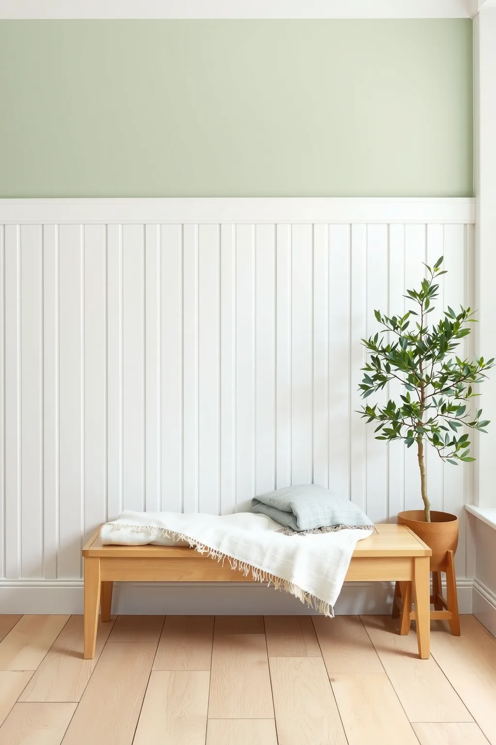
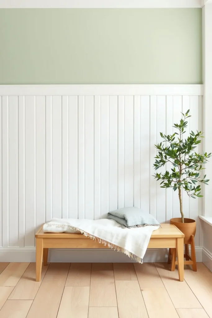
The most common two-tone scheme keeps the panel and trim white and puts a light color on the upper wall: a pale blue-gray, a soft sage, or a warm greige. The white panel gives the wall a fresh, architectural base, and the color above sets the mood without the commitment of painting the whole room dark. Aim for an LRV difference of about 15 to 30 points so the line at the rail is visible but not harsh.
This works in almost any room with an 8 foot ceiling and a traditional 32 to 36 inch panel. It is also the easiest scheme to change later, because only the upper wall needs repainting when you want a new color.
2. Color Below, White Above
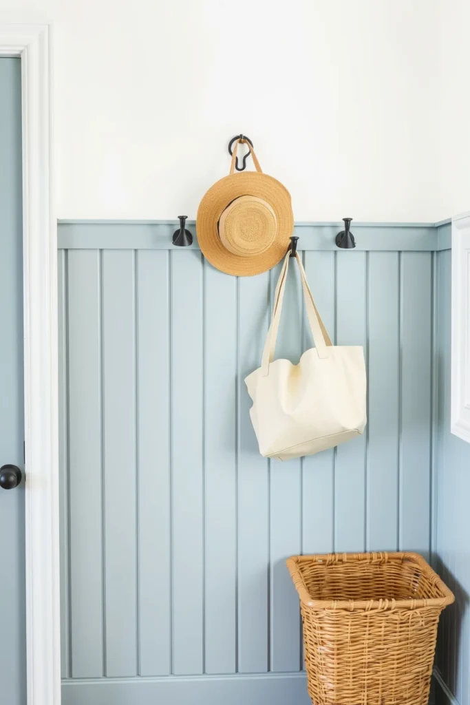
Reversing the first scheme puts the color on the panel and keeps the upper wall white. Because the battens add shadow lines, color on the panel reads richer than the same color on flat drywall, so a mid-tone such as dusty blue or sage often looks a shade deeper once it is on the boards.
This is the classic choice for mudrooms, kitchens and kids’ rooms, where the lower wall takes scuffs: a colored panel in satin hides marks far better than white, and the white upper wall keeps the room bright. Paint the top rail the panel color for a cleaner, more modern line, or white for a traditional framed look.
3. One Color, Top to Bottom
Painting the panel, the upper wall and the trim in a single color, sometimes called color drenching, is the answer to the question of whether board and batten can be the same color as the walls. It can, and the result is a quiet, textured wall where the battens show only through their shadows. It suits small rooms especially well, because there is no line at the rail to cut the wall in half.
The trick is to vary the sheen rather than the color: satin on the panel and trim, matte above. The small difference gives the wall depth without breaking the single-color effect. Mid-tones with an LRV of about 40 to 60 show the batten shadows best; very pale whites can make the battens almost disappear.
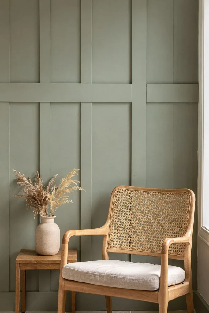
4. Tone-on-Tone: Same Color, Two Strengths
Many paint cards show three to seven strengths of one hue on the same strip. Using a deeper strength on the panel and a lighter one above gives a two-tone wall with no risk of clashing undertones, because both colors come from the same base. Keep the LRV difference to about 10 to 20 points.
Tone-on-tone suits bedrooms and open-plan rooms, where a hard contrast line would compete with the rest of the space. Sage, clay, blue-gray and taupe all work well this way.
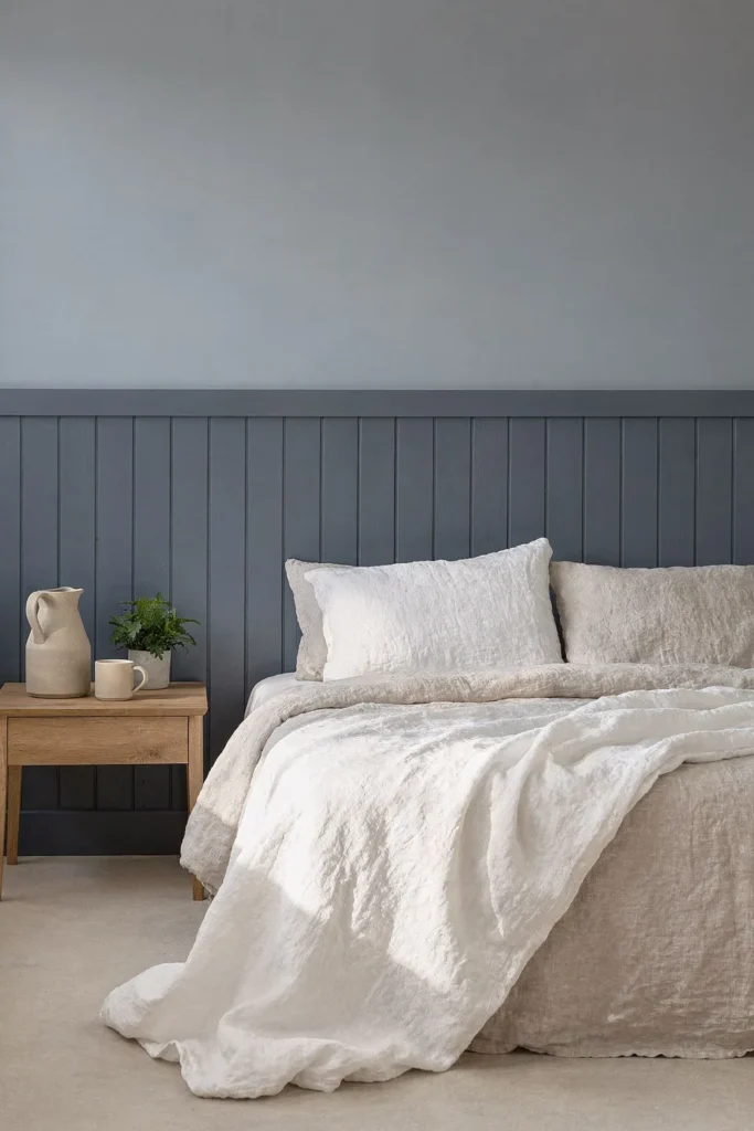
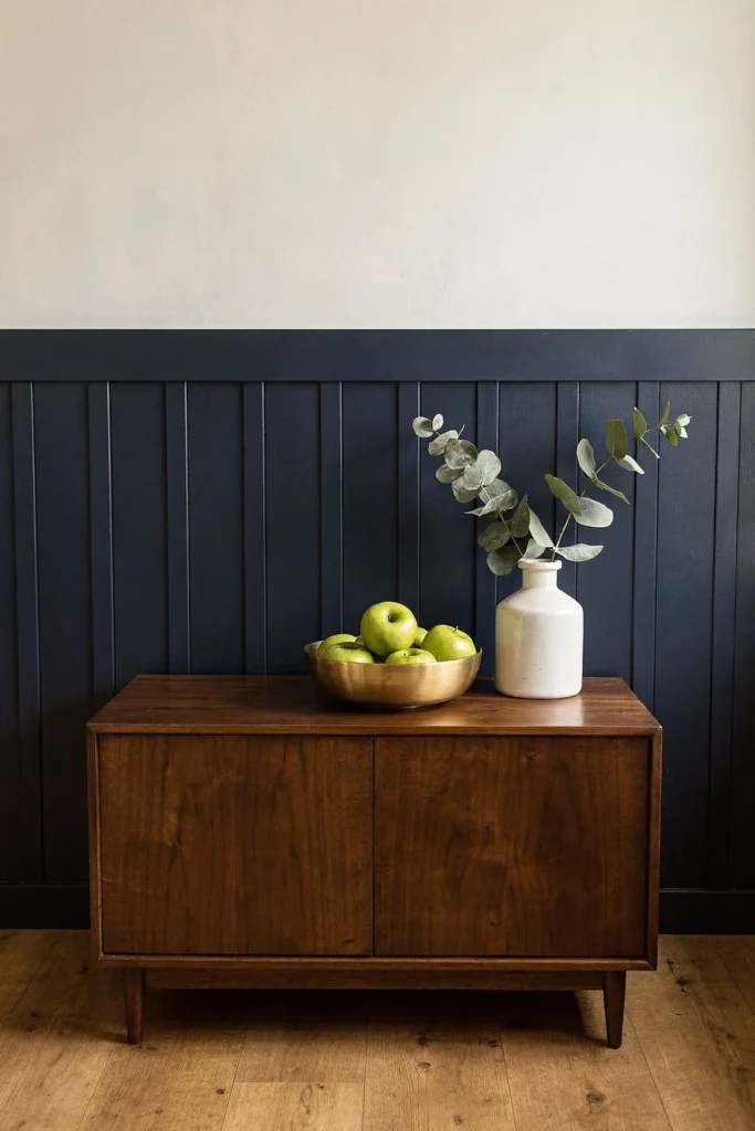
5. Navy Panel With a Warm White Above
Navy with white is the strongest classic pairing, with an LRV difference of 60 points or more. Choose a warm or neutral white above rather than a stark blue-white, because the warmth keeps the navy from looking cold, especially in a north-facing room. Brass hardware, warm wood and cream textiles finish the scheme.
Because the contrast is high, this combination shows the panel line clearly. Check that the top rail is level before painting, since a navy panel under white will reveal even a small dip. It works best in dining rooms, entryways and on one wall behind a bed.
6. White Below, Light Blue-Gray Above
This pairing comes up often in searches for a two-tone wall that feels calm rather than bold: a white panel with a pale blue-gray upper wall at an LRV of about 60 to 70. The blue-gray reads as a soft color in daylight and as a near-neutral at night, so the room does not change character as much between morning and evening.
Among board and batten color combinations, it is one of the safest for bedrooms, bathrooms and hallways. Pick a white with a slight cool or neutral undertone for the panel, because a creamy white beside blue-gray can look yellow.
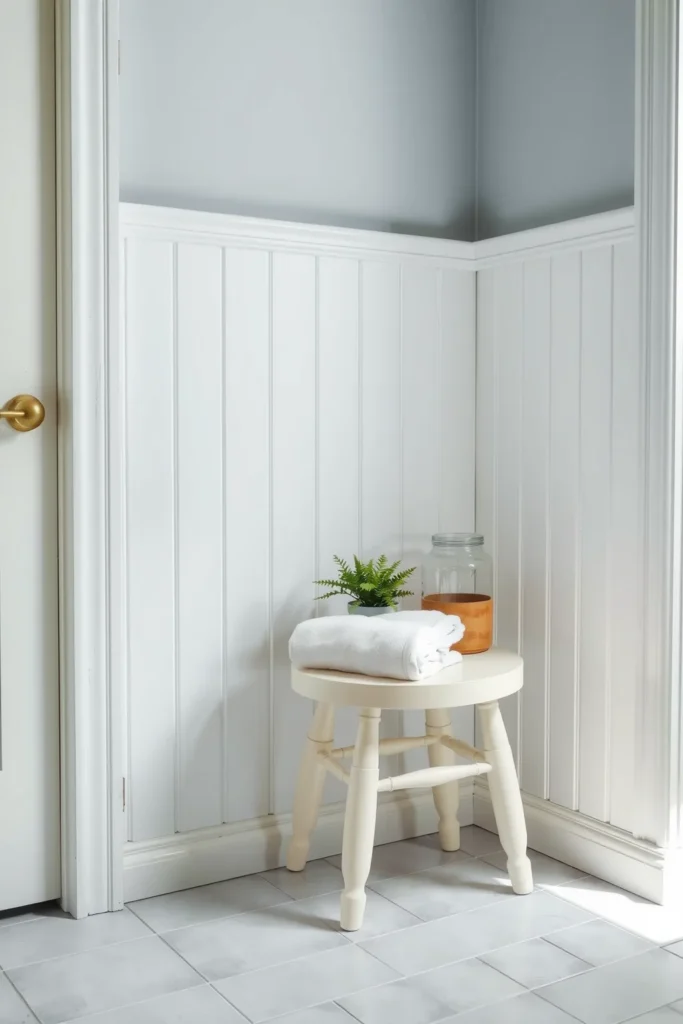
7. Battens in a Contrast Color
Instead of painting the panel one color, paint the battens and rail a different color from the flat wall between them. White battens over a sage or blue board, or black battens over white, turn the wall into a grid and put all the attention on the spacing of the battens.
Because every batten becomes a visible line, this scheme needs even spacing: 12 to 16 inches between battens on most walls, with the spacing adjusted so the end gaps match. Painting it is slower, too, because each batten needs a cut-in line on both sides. Keep it to one feature wall.
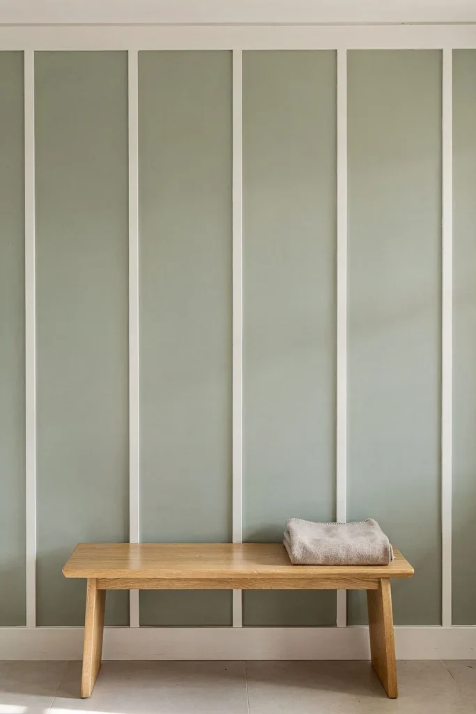
8. Stained Wood Battens With a Painted Wall
Not every combination is two paints. Stained or clear-sealed wood battens over a painted board, or a painted upper wall above a natural wood panel, mix a material with a color. Light oak or honey tones pair well with white, cream and soft green; walnut and darker stains pair with warm white, clay and deep green.
Choose solid wood rather than MDF for this scheme, since MDF has no grain to show. Seal the wood with a clear matte or satin finish so it does not mark easily, and choose the paint color by holding a sample against the stained wood, because stain color changes a lot from one species to another.
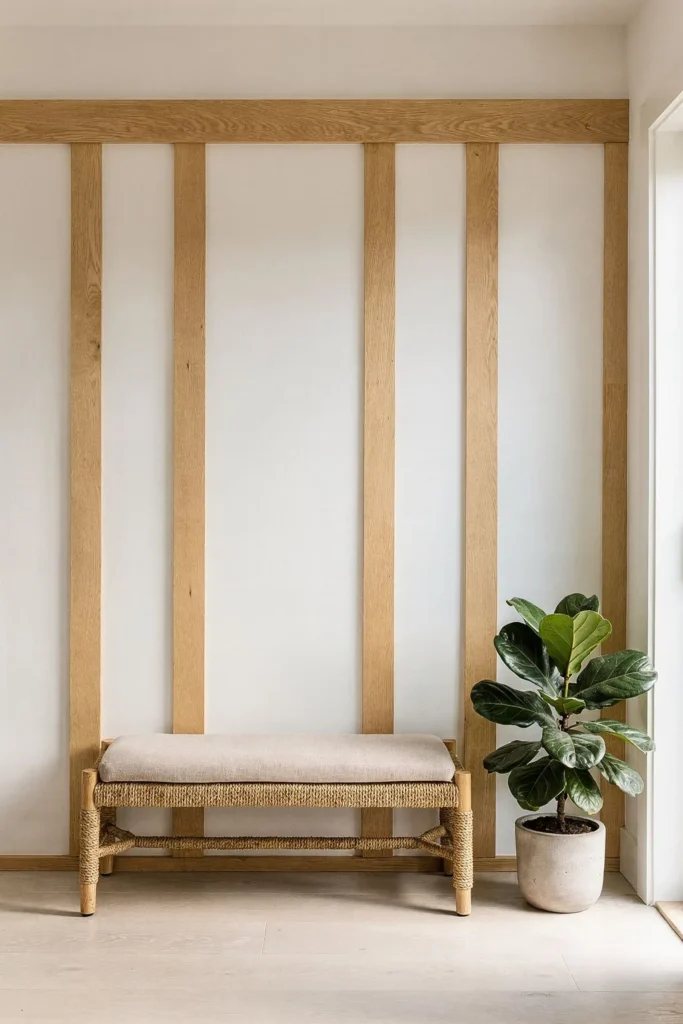
9. Charcoal Panel With Greige Above
For a darker scheme that is softer than navy and white, put charcoal on the panel and a warm greige above, at an LRV of about 50 to 60. The difference is still strong, but neither color is pure, so the wall feels grounded rather than graphic. It suits home offices, living rooms and a teen’s bedroom.
Dark panels show every flaw in the filling and caulking, so fill nail holes with a paintable filler, sand flush and prime before the top coats. Plan for two coats over a tinted gray primer, or three without one.
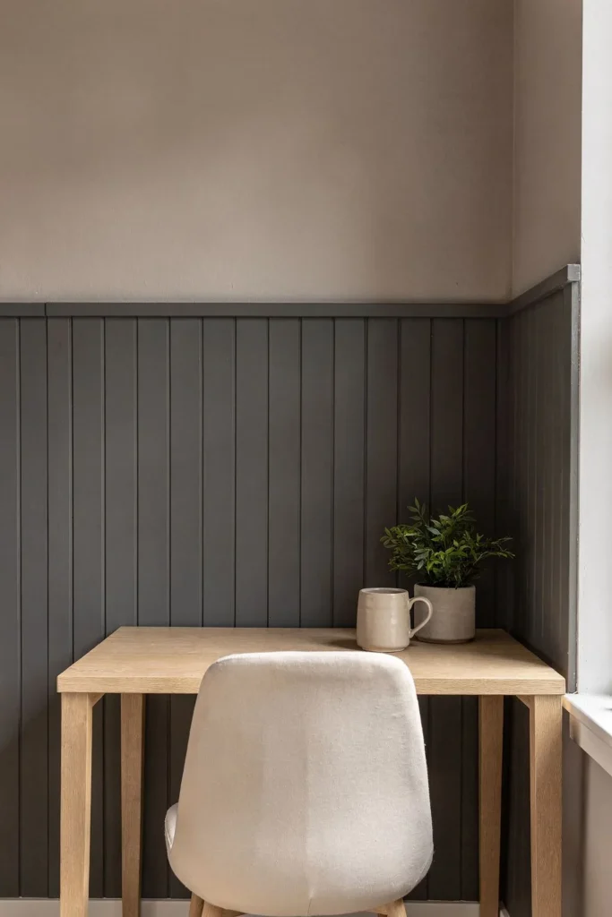
10. Black Panel, White Above
Black under white is the highest-contrast combination there is, around 80 points of LRV difference. On a tall two-thirds panel it gives a room a strong, modern base; on a low panel it can make the wall look cut in half, so the taller panel usually works better.
Use it where the room gets good daylight, and repeat black at least once elsewhere, such as chair legs or hardware, so the panel is not the only dark thing in the room. Matte or satin black forgives imperfect drywall better than semi-gloss.
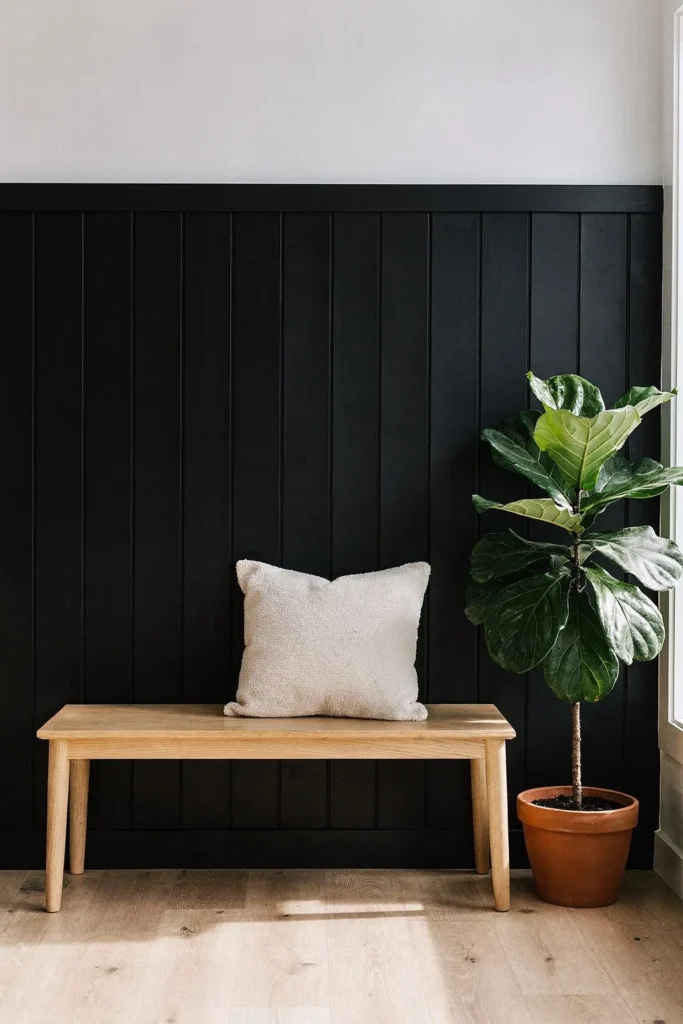
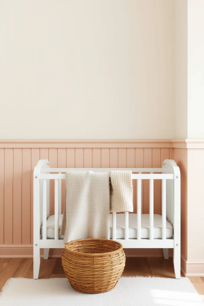
11. Blush or Clay Panel With Cream Above
Warm schemes work well when both colors share a red or yellow undertone: a dusty blush or soft terracotta panel under a cream upper wall. The LRV difference stays modest, around 15 to 25 points, so the wall feels warm and soft rather than bold. It is a good fit for nurseries, guest rooms and any room that faces north and needs warmth.
Avoid pairing a warm panel with a cool, blue-white above; the contrast in undertones makes the panel look muddy. If the room already has gray flooring, lean toward clay rather than pink so the floor and wall do not fight.
12. Three Colors: Panel, Wall and an Accent Rail
A three-color scheme adds a separate color to the top rail or ledge, usually the darkest or the brightest color in the room, so it reads as a thin line between panel and wall. For example: white panel, soft green wall, and a deeper green rail; or sage panel, cream wall and a natural wood ledge.
Keep the rail narrow, about 1.5 to 3.5 inches, and keep the other two colors close in LRV so the rail does the work. In a room full of patterned textiles it can look fussy.
Board and Batten Color Combinations by Room
| Room | Schemes that suit it | Watch out for |
|---|---|---|
| Bedroom | Tone-on-tone, white below blue-gray, one color top to bottom | High contrast behind the bed can feel busy at night |
| Living room | White panel with soft color, charcoal and greige | Undertone clashes with the sofa and floor |
| Entryway and mudroom | Color below and white above, navy and white | White panels showing scuffs from bags and shoes |
| Dining room | Navy and white, black and white, stained wood | A low panel under a dark color cutting the wall in half |
| Bathroom | White below blue-gray, color below and white above | Flat or matte sheen near water |
| Kids’ room and nursery | Color below and white above, blush or clay with cream | Very dark panels in small rooms |
For room-specific detail, our guides to the board and batten bedroom and the board and batten bathroom cover spacing and materials for each, and if you are choosing a color for the whole bedroom rather than one wall, the bedroom paint colors list is a good place to start. Warm, earthy pairings like clay and cream also tie in with the palette in our earth tones living room guide.
How Much Paint a Two-Tone Wall Needs
One gallon of wall paint typically covers about 350 to 400 square feet per coat. Battens add surface area, roughly 10 to 15 percent more than the flat wall alone for 1×3 battens at 12 to 16 inch spacing, because every batten has two edges to cover. For a 12 foot wall, 8 feet tall, with a 36 inch panel:
- Panel: 12 x 3 feet = 36 square feet, plus about 15 percent for battens, so about 41 square feet per coat.
- Upper wall: 12 x 5 feet = 60 square feet per coat.
- Two coats each: about 82 square feet of panel color and 120 square feet of upper color, so a quart (about 90 square feet) covers the panel and a gallon covers the upper wall with plenty to spare.
Dark and saturated colors often need a third coat, or a tinted primer first, so buy a little more for navy, charcoal, black and deep greens. Cut in the rail line with the lighter color first, then paint the darker color over the line: dark covers light far more easily than the other way around. Our guide on how to paint a room covers the cutting-in and taping steps in more detail.
If the wall is not built yet, read the planning steps in board and batten interior walls before you buy paint, because the panel height changes which board and batten color combinations look balanced.
Frequently Asked Questions
Should board and batten be the same color as the walls?
It can be. Painting the panel and the upper wall the same color gives a quiet, textured wall where the battens show only through their shadows, which suits small rooms and bedrooms. Use satin on the panel and matte above so the wall still has some depth. A two-tone scheme is better when you want the panel to stand out as a feature.
What color goes with white board and batten?
Almost any color above a white panel works, as long as the undertones match. Soft blue-gray, sage and warm greige are the most common choices, with an LRV difference of about 15 to 30 points from the white. For more drama, a deep green or navy upper wall gives a strong line at the rail.
Should the dark color go on the top or the bottom?
The darker color usually goes on the bottom. A dark panel grounds the room, hides scuffs at the height where walls get touched, and lets the lighter upper wall reflect more light toward the ceiling. A dark upper wall above a light panel can make the ceiling feel lower, especially at 8 feet or less.
What paint finish is best for board and batten?
Satin or semi-gloss is the usual choice for the battens and panel, because it wipes clean and outlines the boards slightly. The upper wall usually takes matte or eggshell, which hides drywall flaws. Using two sheens is also how a one-color wall keeps some depth.
How much contrast should a two-tone board and batten wall have?
For a soft two-tone look, aim for a difference of about 10 to 30 points in light reflectance value (LRV) between the panel and the upper wall. For a strong, graphic line, aim for 30 to 50 points or more, such as navy or black under white. Under 10 points reads as tone-on-tone.