Earth tones — terracotta, warm ochre, sage green, deep chocolate brown — read as grounded and calm because they sit low in saturation and lean toward the red end of the spectrum. Light bouncing off a warm clay wall is inherently softer than light bouncing off a cool gray or stark white, which is a big part of why these colors read as cozy rather than just brown. But color is only one piece of it: a room painted top to bottom in terracotta can still feel flat if everything is the same texture and the lighting is wrong.
The ten approaches below cover what actually makes an earth-toned living room feel warm: material texture, wood tone, light temperature, and how you arrange what you already own. None of it requires a renovation — most of these are swaps and additions you can make over a weekend.
1. Layer Real Material Textures, Not Just Colors
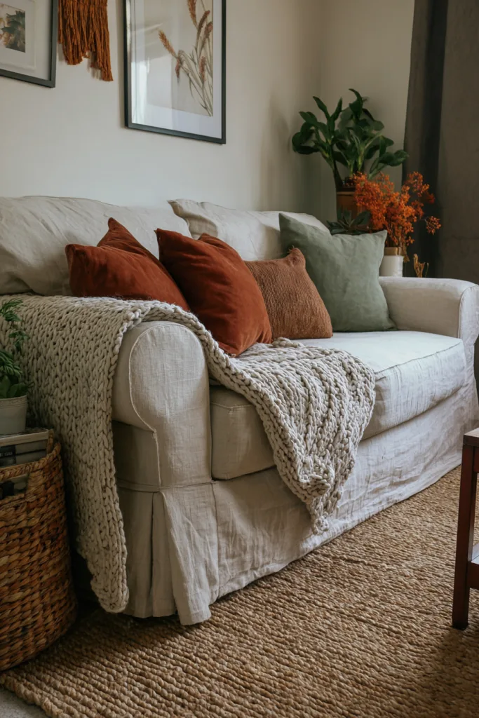
Color-matching alone won’t get you to cozy — texture is doing more of that work than the paint chip. Mix a boucle or chunky knit throw, linen or cotton canvas cushions, a jute or wool rug, and at least one raw or unglazed surface like a stoneware bowl or an unfinished wood tray. Start with a neutral base — cream, oatmeal, or mushroom-colored upholstery — then layer earth-toned textiles on top so the color reads as accents rather than a solid block.
Keep it to two or three distinct textures per seating area. More than that starts to look cluttered rather than layered; fewer and the room reads flat no matter how good the color palette is. A practical mix: one smooth surface (linen), one nubby one (boucle or wool), and one natural fiber (jute or rattan) in the same grouping.
2. Mix Wood Tones With One Dominant Note
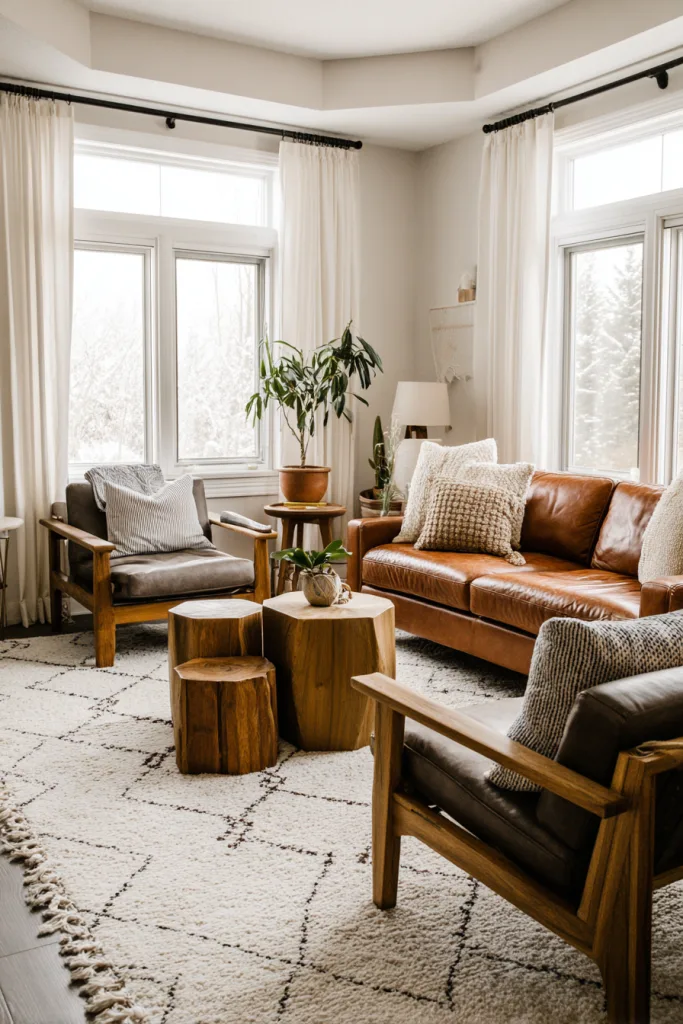
Wood grounds a room in a way paint alone can’t, and mixing wood tones is no longer the design mistake it was once considered — matching every wood surface in a room usually looks more like a furniture showroom than a lived-in home. The trick is to let one tone dominate. Aim for roughly 60-70% of the visible wood in the room — floors, the largest furniture pieces, trim — in one tone, such as walnut or oak, and let a secondary tone show up in smaller pieces: a side table, a picture frame, a tray.
Live-edge and reclaimed wood pieces work particularly well in an earth-tone room because the visible grain and imperfections add texture a plain painted surface can’t. A single walnut coffee table or console paired with lighter oak shelving reads as intentional; five different wood tones spread evenly across the room usually just reads as mismatched.
3. Choose Warm Wall Colors and the Right Sheen
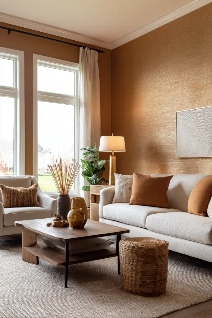
Paint is the highest-impact, lowest-cost way to bring earth tones into a living room — a gallon covers roughly 350-400 square feet for one coat, so testing a color commitment on a wall costs far less than committing to a sofa or rug in the same shade. Warm neutrals like mushroom gray, soft clay, or a muted sage read as calming rather than dull once paired with the textures above.
Sheen matters as much as the color itself. Matte and eggshell finishes scatter light softly and hide minor wall imperfections, which is why they read as warmer and cozier than satin or semi-gloss. Save the higher sheens for trim, doors, and high-touch surfaces where washability matters more than warmth. If you’re not ready to commit to paint, textured grasscloth wallpaper, wood paneling, or a large piece of art in the same tone gets you most of the way there without opening a can.
4. Add Weight With Pottery and Ceramics
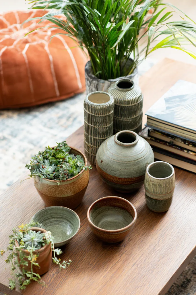
Handmade or hand-finished pottery in terracotta, ochre, or sage brings both color and a tactile, slightly irregular surface that manufactured decor rarely has — the small variations in glaze and shape from piece to piece are what make a grouping look collected rather than purchased as a set. Large floor vases, sculptural bowls, and planters that double as display pieces all work well.
Group pieces in odd numbers — three tends to read better than two or four — and vary the height and shape within a grouping so it doesn’t look like a matching trio. Mixing a few different glaze finishes, like a matte terracotta next to a glossier ochre, within the same warm palette adds interest without breaking the color story. Unglazed or raw stoneware pieces pair especially well with the textiles above, since they carry the same unfinished, natural-material quality.
5. Use Plants for Color That Doesn’t Come From Paint
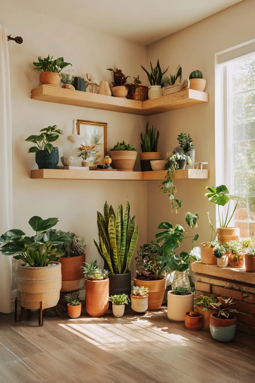
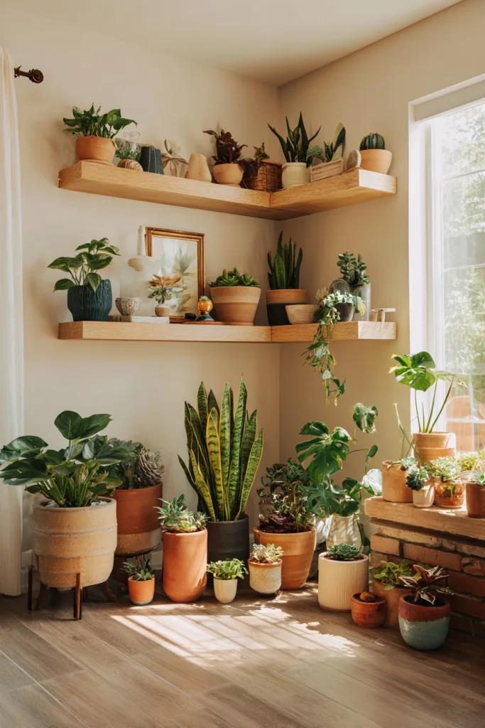
Plants bring earth tones into a room without touching a paint can or fabric swatch — foliage color varies more than people expect, from the silvery-green of dusty miller to the burgundy of a rubber tree to the gray-green of an olive tree. A large floor plant, such as a fiddle leaf fig or snake plant, in a terracotta or unglazed ceramic pot anchors a corner the way a piece of furniture would.
For smaller spaces, group two or three plants of varying heights on a side table or shelf rather than spreading single plants around the room — groupings read as intentional, scattered singles read as afterthoughts. Match the planter material to your other earth tones: raw clay, woven rattan, or a ceramic glaze in the same warm family ties the plant into the rest of the room instead of leaving it to sit apart as a green accent.
6. Get the Light Temperature Right
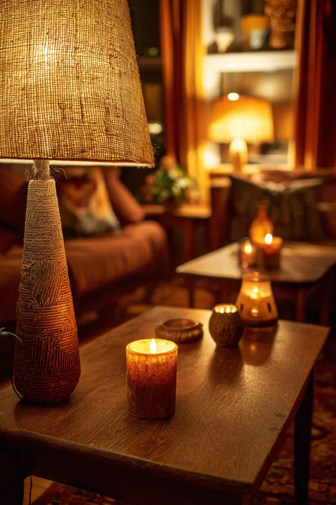
Lighting can undo an otherwise well-planned earth-tone room faster than any other single choice. Warm-white LED bulbs in the 2700-3000K range read as cozy and flatter warm wall colors and wood tones; anything above 3500K reads clinical and cool no matter what color is on the walls — it’s one of the most common reasons a “warm” room still feels sterile.
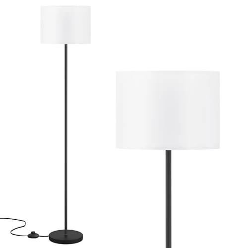
Layer at least two or three light sources rather than relying on a single overhead fixture: a table lamp with a linen or woven shade, a floor lamp with a wood or rattan base, and candles or a dimmer on the main fixture for evenings. Avoid bare, harsh overhead lighting — it flattens color and texture alike. If your fixtures already use warm-temperature bulbs, a dimmer switch is one of the cheapest upgrades for controlling mood between daytime and evening use.
7. Choose Artwork That Extends the Palette
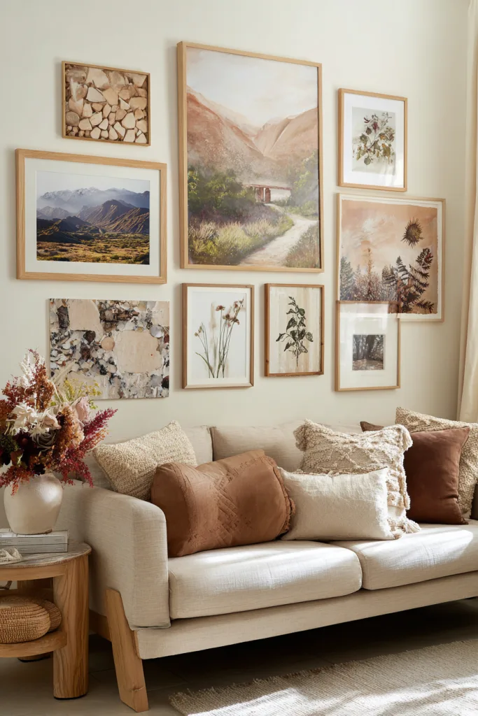
Art can do double duty as color and personality: abstract pieces in rust and ochre, landscape or desert photography, or botanical prints in sage and moss all extend the room’s color story onto the walls. Mixed-media pieces that incorporate actual wood, stone, or dried botanicals add texture a flat print can’t.
A gallery wall of several smaller pieces often has more visual impact per square foot than a single large piece, and it’s more forgiving if your collection is a mix of styles rather than a matched set — the color palette, not the subject matter, is what ties it together. Frame in natural wood or warm metal tones like bronze, brass, or warm black rather than cool silver or chrome, which will visually fight the rest of the room.
8. Anchor the Room With a Natural Fiber Rug
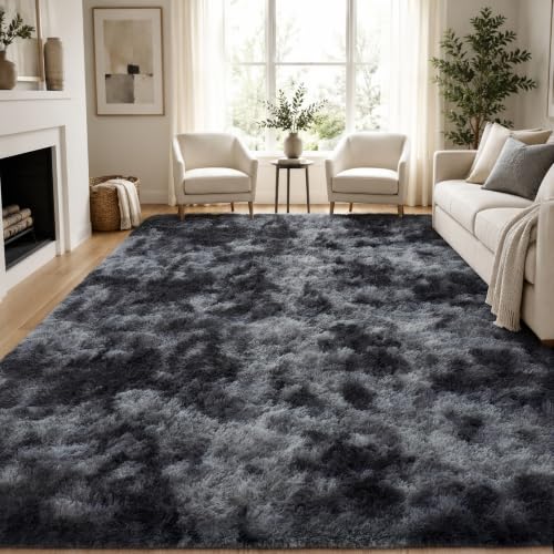
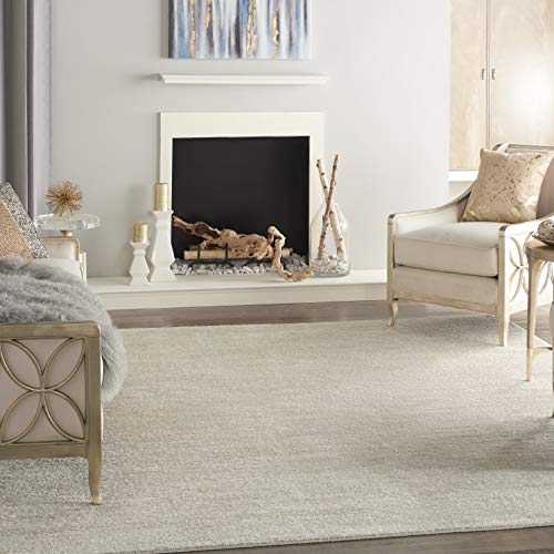
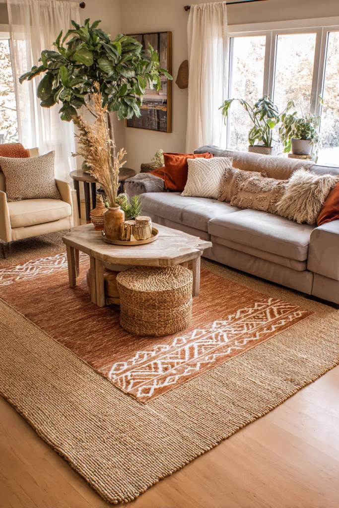
A rug in natural fiber and earth tones does double duty — it adds warmth underfoot and visually anchors the seating area. Jute is durable and inexpensive but coarser underfoot; sisal has more subtle pattern variation and a slightly softer texture; wool in warm brown or sage tones is the softest of the three but costs more per square foot.
Size matters more than most people budget for. For a rug to anchor a seating area rather than look like a mat floating in the room, it should be large enough that at least the front legs of your sofa and chairs rest on it — for most living rooms that means an 8×10 or 9×12 rug, not the smaller size that looked right in the showroom. Layering a smaller patterned wool rug over a larger neutral jute one adds pattern without losing the grounding effect of the larger piece.
9. Style Shelves With Restraint
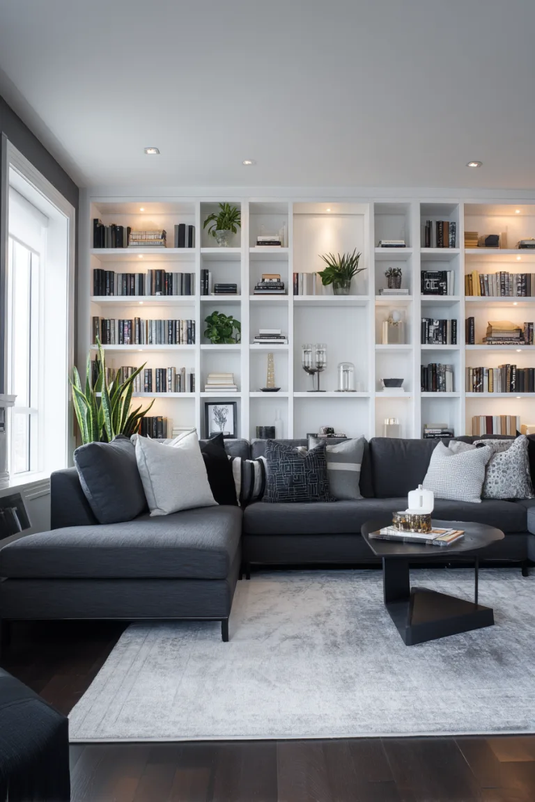
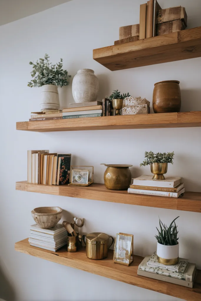
Open shelving is one of the easiest places to lose an earth-tone palette to clutter. Mix a few natural elements — a smooth stone, a piece of driftwood, a dried branch — with a small number of ceramic pieces in warm glazes, and leave visible negative space between groupings. Overcrowded shelves read as storage, not styling, no matter how good the individual pieces are.
Group in odd numbers, since three tends to work better than an even number, and vary height within each grouping: a tall vase, a stack of two or three books, a low bowl. When in doubt, remove rather than add — a shelf with six well-chosen pieces and breathing room between them reads as more considered than one with twelve pieces crammed edge to edge.
10. Arrange Seating for Conversation, Not Just a TV
How furniture is arranged affects the cozy feeling as much as color does. Angle chairs toward each other rather than lining everything up facing a screen, keep a side table within reach of every seat, and use an ottoman that can double as extra seating when you have guests. A room where every seat faces the same direction reads as formal and passive; one where seats face each other reads as a place people actually talk.
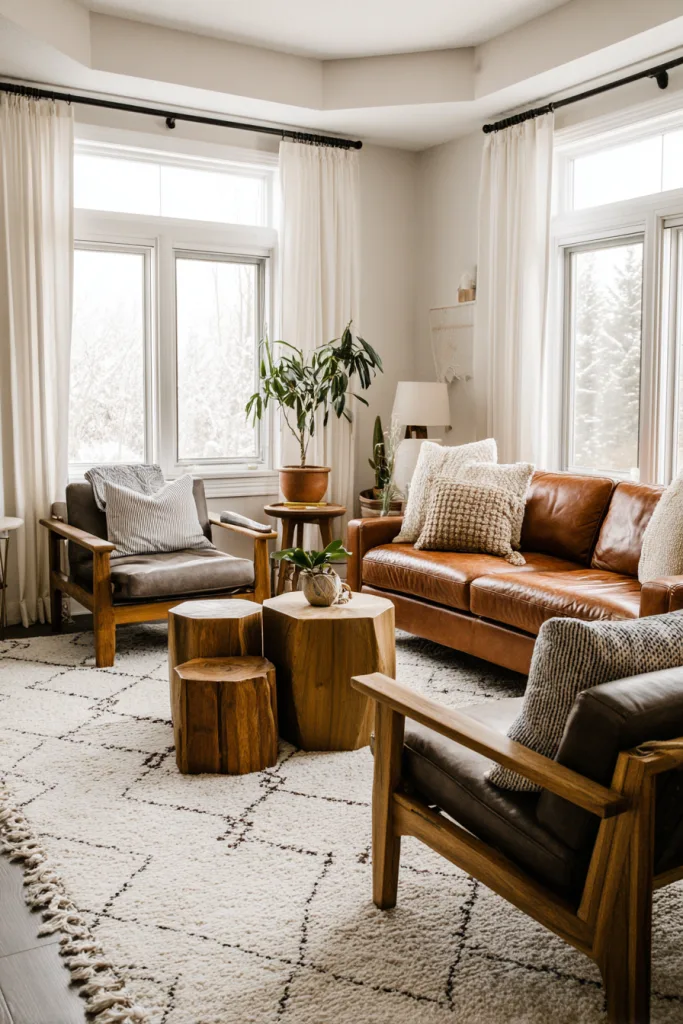
Furniture doesn’t need to match to feel cohesive in an earth-tone room — a leather sofa in cognac paired with a linen armchair in sage works because both sit within the same warm, muted color family, not because the materials match. Add personal touches, like framed photos in wood frames or a throw that’s actually meant to be used, rather than styling the room to look untouched — a lived-in room reads warmer than a showroom-perfect one regardless of the palette.
Bringing It Together
An earth-toned living room comes together through layered texture, a dominant wood tone, warm-temperature lighting, and furniture arranged for conversation — color alone won’t get you there. Start with one or two changes that are easy to reverse, like swapping bulbs or adding a textured throw, before committing to paint or a large rug.
Build the palette gradually. A single accent wall, a jute rug, or a few pieces of pottery can establish the direction, and the rest of the room can fill in over time as budget and opportunity allow. The advantage of a warm, muted palette like this is that new pieces rarely clash with what’s already there, which makes it one of the more forgiving approaches to decorating a room in stages rather than all at once.
FAQ
Q: How much does it typically cost to decorate a living room with earth tones? A: It can be budget-friendly, since plants, natural accessories, and small DIY touches cost very little. Small changes like throw pillows, candles, and artwork can come in under $200; larger pieces like furniture and rugs push a more comprehensive makeover toward $1,000-5,000, depending on room size and quality.
Q: What’s the best way to incorporate earth tones if I’m renting and can’t paint walls? A: Lean on removable elements — large artwork, tapestries, or peel-and-stick wallpaper for wall impact, and textiles like curtains, rugs, throw pillows, and blankets to carry color throughout the room. Large plants in earth-toned planters and substantial furniture in natural materials round out the palette without permanent changes.
Q: How do I keep an earth-toned living room from looking flat or too monochromatic? A: Mix textures, patterns, and varying shades within the palette rather than relying on one flat color. Combine smooth ceramics with rough jute, pair solid colors with subtle patterns, and use different tones of the same color family. Varied heights, interesting shapes, and good natural light all add the visual interest that a single flat tone can’t provide on its own.
Q: Can earth tones work in a small living room, or will they make it feel cramped? A: Lighter earth tones — warm beige, soft sage, cream — on walls and large furniture keep a small room feeling open, while darker earth tones work well as accents through pillows, artwork, and small pieces. Good lighting and a well-placed mirror to bounce natural light both help keep the room from feeling closed in.