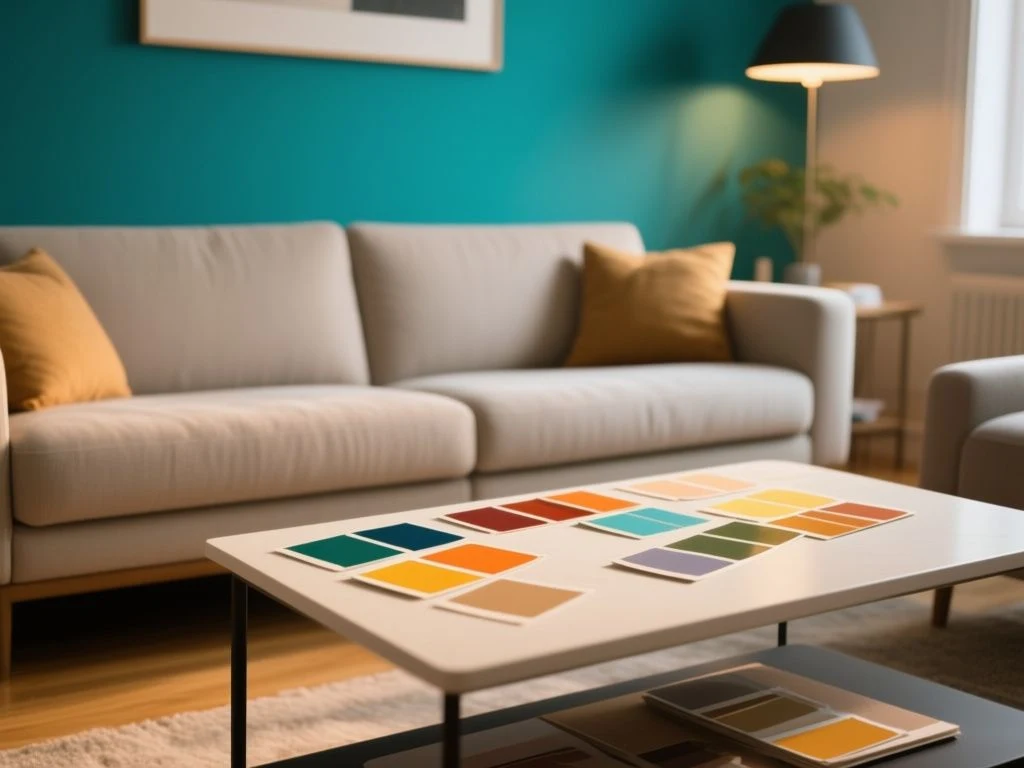
You spend an hour squinting at paint chips, bring home a sample pot, paint a test patch, and by the next morning the shade you loved has turned muddy, too pink, or strangely green. That’s the exact frustration most people hit when they try to pick a colour scheme for a room.
A colour’s appearance is not fixed; it shifts with light, surface texture, and the colours sitting next to it. A scheme that looks balanced on a swatch can fall apart in a room when natural light changes from morning to evening. The experienced approach starts with the room’s fixed elements—its flooring, architecture, and window orientation—and selects hues that work with those constraints, rather than starting with a favourite colour you saw online.
In this guide you will learn a step-by-step method for choosing a room colour scheme that survives real-world lighting: measuring light reflectance value, applying the 60-30-10 rule without treating it as law, testing colours the right way, and coordinating them with existing furniture and artwork.
Key Takeaways
- Always test paint colours at home with large swatches and observe them at different times of day; colours transform under daylight, LED, and incandescent light.
- Use light reflectance value (LRV) to predict how bright or dark a colour will make a room—higher LRV reflects more light and suits small spaces.
- The 60-30-10 rule (dominant, secondary, accent) is a safe starting point, but break it deliberately when the room calls for it.
How to Pick a Colour Scheme for a Room: Start With Fixed Elements
Before you fall in love with a wall colour, stand in the middle of the room and list every surface and feature you are not going to change. Flooring, trim, doors, window frames, built-in shelving, and even the existing sofa if it’s staying. These fixed elements carry their own undertones, and the wall colour needs to sit comfortably next to them.
Look at Flooring, Architecture, and Window Direction
Hardwood floors usually lean warm (red, orange, or yellow) or cool (grey, ash, or whitewashed). Tile and stone floors have their own cast—porous materials like marble, travertine, or limestone can have strong beige or grey undertones that affect reflected light. Note whether your architecture has rustic woodwork or crisp white trim; each requires a different saturation level from your walls.
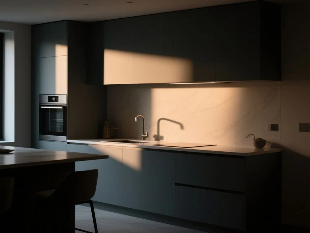
Window direction is the biggest invisible hand in a room. North-facing windows bring cool, steady, bluish light all day, which makes warm colours look duller and cool colours look cleaner. South-facing windows flood a room with warm, yellow light that can make cool greys look blue and warm creams look sunny. East-facing rooms get bright morning light that fades to cool shade by afternoon; west-facing rooms get soft morning light then intense, golden afternoon light that warms everything toward orange.
Failing to account for window direction is why a colour that looked perfect on a paint chip turns sour on the wall.
Measure Light Reflectance Value (LRV) Before Falling for a Swatch
Every paint colour has a light reflectance value, or LRV, on a scale of 0 to 100. This number tells you how much light the colour reflects: a pure white sits near 85–90, while a deep charcoal might be 10 or below. The LRV is printed on most paint brands’ colour cards or online product pages, and it is the single most reliable predictor of how a colour will behave in a small or dark room.
The Munsell Color System, standardized under ASTM D1535, provides the numerical framework that underpins modern LRV measurements and paint colour notation. Knowing a colour’s LRV lets you work with the room’s light rather than against it. In a north-facing room with little daylight, choose wall colours with an LRV above 60 to keep the space from feeling like a cave. In a bright south-facing room you can afford to go lower, even down to 30 or 40 on an accent wall, because the daylight will bounce around and keep the colour lively.
Step 2: Build a Color Foundation Using the 60-30-10 Rule
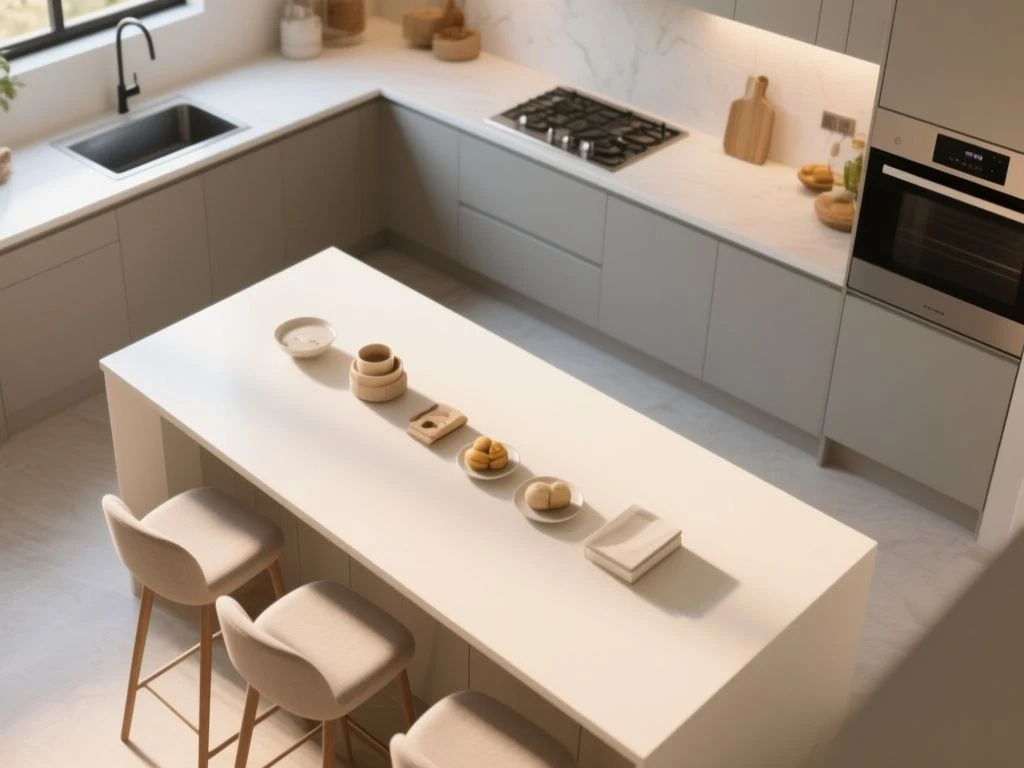
Once you understand the room’s light and fixed surfaces, you can start assembling a palette. The most reliable beginner’s framework is the 60-30-10 rule: roughly 60 percent of the room should be a dominant colour, 30 percent a secondary colour, and 10 percent an accent. This is not a law of physics—many designers break it intentionally—but it prevents the most common failure of too many colours fighting for attention.
Dominant Color (60%) – Often a Neutral with a Specific Undertone
The dominant colour is typically your wall colour, and in most rooms it works best as a neutral: white, grey, beige, greige, or a very soft pastel. The key is to choose that neutral by its undertone, not by its name. A “white” paint can have pink, yellow, blue, or green undertones, and the wrong undertone will clash with your flooring or sofa.
Hold the paint chip against a pure white sheet of paper to reveal its undertone. If you see a hint of pink, it’s a pink-based white; if you see a hint of yellow, it’s warm. Match that undertone to the undertone of your fixed elements—for example, oak floors with an orange cast pair better with a warm white than with a blue-white.
Secondary Color (30%) – Adds Depth Without Overwhelming
The secondary colour shows up on large furniture, area rugs, window treatments, or an accent wall. It should be a direct complementary or analogous partner to the dominant colour on Itten’s colour wheel. For a warm neutral wall, a secondary of deep blue or olive green creates balance; for a cool grey wall, a secondary of blush pink or soft terracotta brings warmth. Avoid choosing a secondary that has the same lightness as the dominant colour—contrast in value is what makes a room feel intentional rather than washed out.
Accent Color (10%) – The Small Dose That Carries the Room
The accent colour belongs in small doses: throw pillows, a single piece of art, a lamp base, the inside of a bookshelf, or a small piece of furniture. This is where you can be bolder. A saturated mustard, emerald, or burnt orange often works well as the 10 percent even if you would never paint a full wall that colour. Keep the accent to two or three objects scattered around the room so the eye travels instead of landing on one loud spot.
Step 3: Test the Colors in Your Actual Room
This is the step that separates successful colour schemes from expensive mistakes. A colour looks different on a vertical wall than on a horizontal swatch, under LED light than under sunlight, and next to your woodwork than next to a white card. The only way to avoid repainting is to test the colour in situ.
Why Tiny Swatches Lie: The Physics of Light and Surface
Paint chips are printed, not painted, and the inks used in printing do not reproduce the pigments in the can. Even a painted sample pot applied to a small chip is misleading because the surrounding wall colour—usually white—raises the perceived lightness through simultaneous contrast. The sheen of the paint also changes the appearance: glossy finishes reflect more light and make colours look deeper, while matte finishes absorb light and make the same colour look chalky. Flat, eggshell, satin, and semi-gloss each shift the way a colour reads on a wall.
How to Test Properly: Large Sheets, Multiple Walls, All Hours
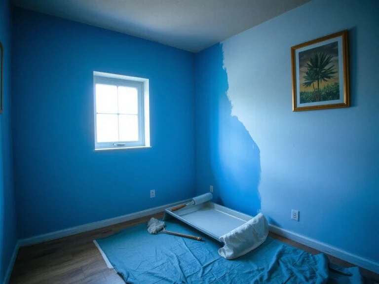
Buy a sample pot and paint a large sheet of white poster board or a section of drywall at least 60 cm by 60 cm. Place this sheet on two different walls—one that gets direct sunlight and one that stays shaded—and move it around the room over the course of a full day. Observe it in the morning, at noon, in the late afternoon, and after dark with your usual lamps on. The colour that holds up best across all these conditions is the one to commit to.
Colour temperature, measured on the Kelvin scale defined by the International Bureau of Weights and Measures (BIPM), explains why this matters: daylight is roughly 5000–6500 K and leans blue, while incandescent bulbs sit around 2700–3000 K and lean yellow. A wall colour that looks balanced under one will shift under the other. If you cannot change the bulbs, test the colour under the exact bulbs you will live with.
Step 4: Coordinate the Scheme With Furniture, Rugs, and Artwork
Your wall colour does not exist in a vacuum. The rug on the floor, the sofa against the wall, and the art hanging at eye level all participate in the final impression. A smart way to ensure cohesion is to build the palette outward from a single patterned piece you already love.
Pull a Hue From a Rug or Painting
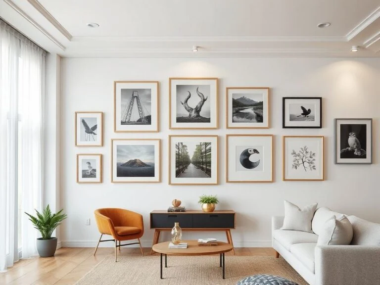
Choose a rug, a favourite painting, or a patterned curtain fabric that already contains three or four colours you enjoy. Then assign those colours to the 60-30-10 roles: the most abundant colour in the pattern becomes your wall colour; a secondary colour from the pattern becomes your furniture or accent wall; and the smallest pop becomes your throw pillows and accessories. This is the fastest way to guarantee that every colour in the room belongs to the same family. If the rug has a cream background with terracotta and deep blue motifs, paint the walls that cream, use blue for a sofa or curtains, and sprinkle terracotta in cushions and a table lamp.
When hanging curtains, whether you choose curtains or blinds can change how much daylight enters the room, which in turn alters how your wall colour reads. Heavier curtains block more light and make the same wall colour look moodier; blinds give you finer control and keep the palette lighter.
Coordinate Undertones Across Materials
Wood, metal, leather, and stone all carry undertones too. A warm oak floor pairs poorly with a cool grey wall that has a blue base, because the two surfaces pull in opposite directions. Instead, look for a grey with a warm brown or green undertone. The same logic applies to trim: crisp white trim against a warm cream wall can look stark, while a softer white with a yellow undertone will blend. If you have the opportunity to repaint woodwork, consider how the wall and trim colours interact; the wrong pairing can make a room feel disjointed even if each colour is beautiful alone.
Step 5: Make the Colors Work for a Small Room
Small rooms punish colour mistakes more than large rooms do, because every wall is close together and the light has less distance to travel. A colour that looks cosy in a sprawling living room can feel suffocating in a compact bedroom or hallway.
Use High LRV Colors and Low Contrast
The single most effective trick for a small room is to keep the wall LRV above 60 and avoid strong contrast between walls, trim, and ceiling. High-LRV colours reflect more of the available light back into the room, which makes the space feel larger and airier. Dark accent walls in a small room work only if the room has an unusually large window or you intentionally want a cosy, cave-like feeling. Most small rooms benefit from the opposite: keep walls, ceiling, and trim within a few LRV points of each other so the boundaries blur.
You can make a small room feel taller by mounting curtain rods close to the ceiling and using full-length curtains that match the wall colour. This draws the eye upward and creates a continuous vertical line. For specific instructions on rod height and curtain length, see how to hang curtains to make a room look taller step by step.
Match Wall and Trim to Blur Boundaries
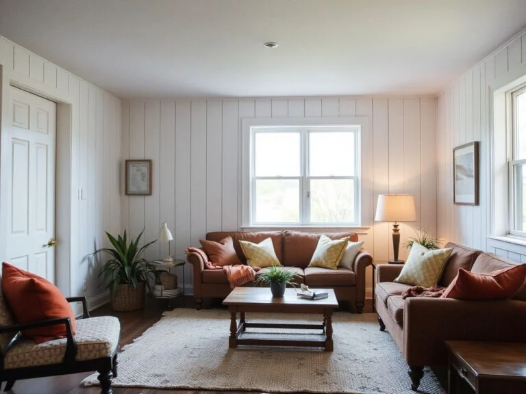
Painting trim and doors the same colour as the walls, or one shade lighter, removes visual interruptions. In a small room every colour break costs you perceived square footage. If you want architectural interest without shrinking the space, try a board and batten treatment on one wall painted the same colour as the rest of the wall in a slightly higher sheen; the texture adds depth without introducing a new hue. For ideas on that approach, look at 17 board and batten walls ideas that transform any room.
Frequently Asked Questions
How many colours should I use in one room without it looking chaotic?
Use three to five colours total, guided by the 60-30-10 rule. The dominant colour covers walls and large expanses; the secondary appears on furniture and window treatments; the accent shows up in small accessories. More than five distinct hues without a unifying undertone tends to read as noisy rather than collected.
Can I use the same colour scheme in different rooms or should each room be different?
You can and often should use a cohesive scheme across rooms, but vary the proportions. A whole-home palette of three to five colours with the same undertones creates flow. In one room the dominant colour might be a warm white, in the next a soft blue-green from the same palette becomes the dominant, while the white becomes secondary. This gives each room its own identity without visual whiplash.
How do I match a paint colour to an existing rug or artwork?
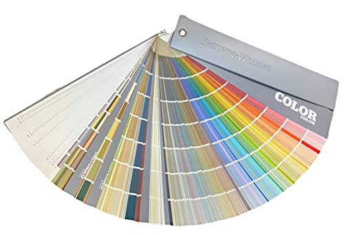
Take the rug or artwork to a paint store and match one of its colours using a fan deck, but always test the matched colour at home. The colour in the rug under store lighting will differ from how it reads on a wall in your room. Alternatively, use a colour-matching app to get a starting point, then verify with painted swatches. The goal is not an exact match but a wall colour that shares the same undertone and lightness so the room feels coordinated.