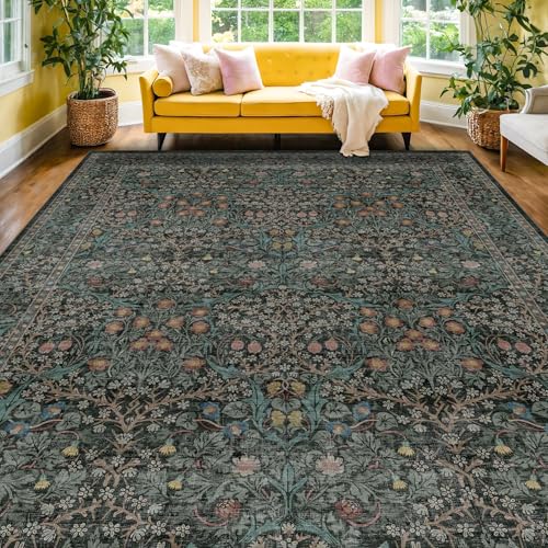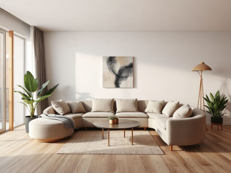
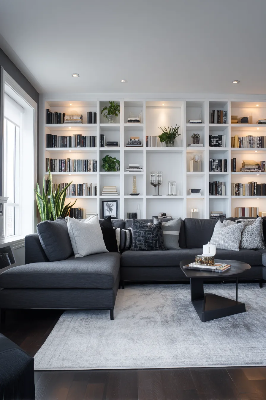
A single wall does more for a living room’s character than almost any other design decision, because concentrating a bold color, texture, or pattern onto one surface lets you commit to something that would feel like too much across all four walls. It’s a lower-risk way to try a strong choice — if a dark green wall or a bold wallpaper doesn’t work out, you’re repainting or re-papering one surface, not the whole room.
The wall usually worth choosing is the one you see first walking in, or the one behind your main seating or media setup — whichever naturally draws the eye without windows, doors, or corners breaking it up. The twelve approaches below range from a can of paint to a full stone or millwork installation, each with real cost and material tradeoffs.
1. Natural Stone Accent Walls
Real Texture That Painted Walls Can’t Fake
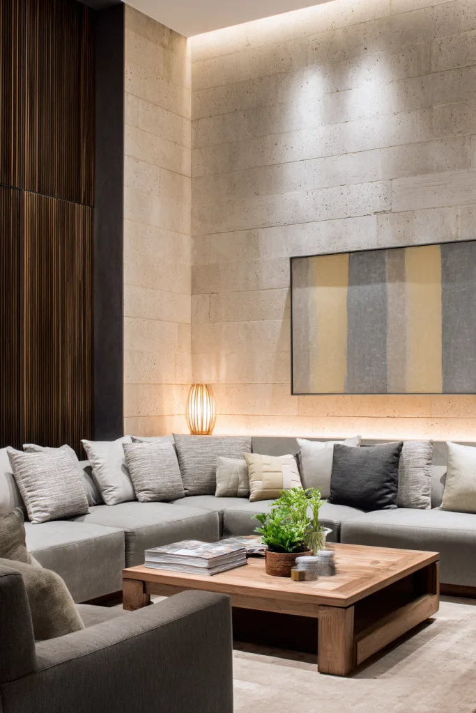
Limestone, slate, and travertine each carry natural variation from piece to piece, so a stacked-stone wall never looks like a repeating pattern the way a printed material can. That irregularity is exactly what reads as high-end rather than manufactured.
Full natural stone is heavy enough that it usually needs a wall that can support the added weight — mortar-set stone can run several pounds per square foot — so this is one accent wall option worth confirming with an installer before you commit, especially in an older home. Thin stone veneer panels are a lighter, often more budget-friendly alternative that install with adhesive or thin-set mortar directly over drywall in most cases, delivering similar visual texture at a fraction of the weight and cost of full-dimension stone.
Designer tip: A thin LED strip run along the top or bottom edge of a stone wall throws shadow across the natural texture, making the variation in the stone more visible in the evening than flat overhead lighting does.
2. Bold Paint Color Statements
The Lowest-Cost, Highest-Impact Option
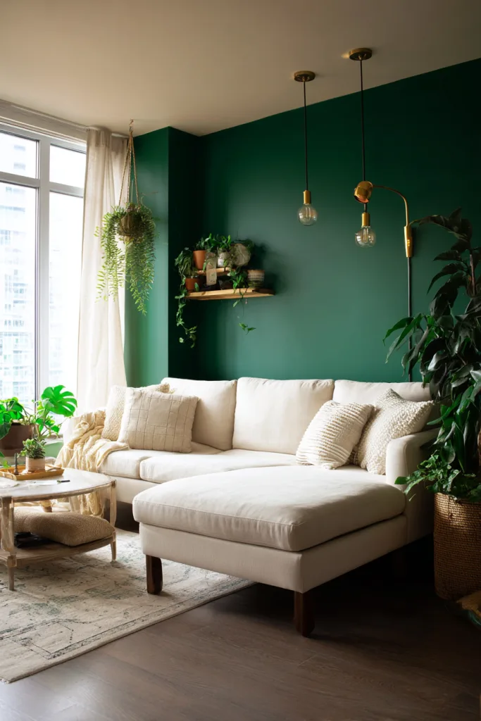
A can of paint on a single wall is the cheapest way to test a bold design decision, and it’s fully reversible if it doesn’t work out. Deep jewel tones — emerald, sapphire, burgundy — read as sophisticated in a well-lit room; warmer choices like terracotta or deep mustard suit rooms that get a lot of natural light without feeling cold.
Test any color as an actual paint sample on the wall, not just a chip, and look at it in morning and evening light before committing — the same color can shift noticeably warmer or cooler depending on the light hitting it. As a general guideline, many designers work from a rough 60-30-10 color split: a dominant neutral across most walls and furniture (60%), a secondary color in larger furniture pieces (30%), and an accent color, which a bold wall can effectively serve as, echoed in smaller doses through pillows or art (10%).
Designer tip: Paint a large sample board, at least 2 feet square, and move it around the room over a full day rather than painting directly on the wall — it can save you a repaint if the color reads differently than expected once it’s up.
3. Textured Wood Paneling
Warmth Without Losing Modern Lines
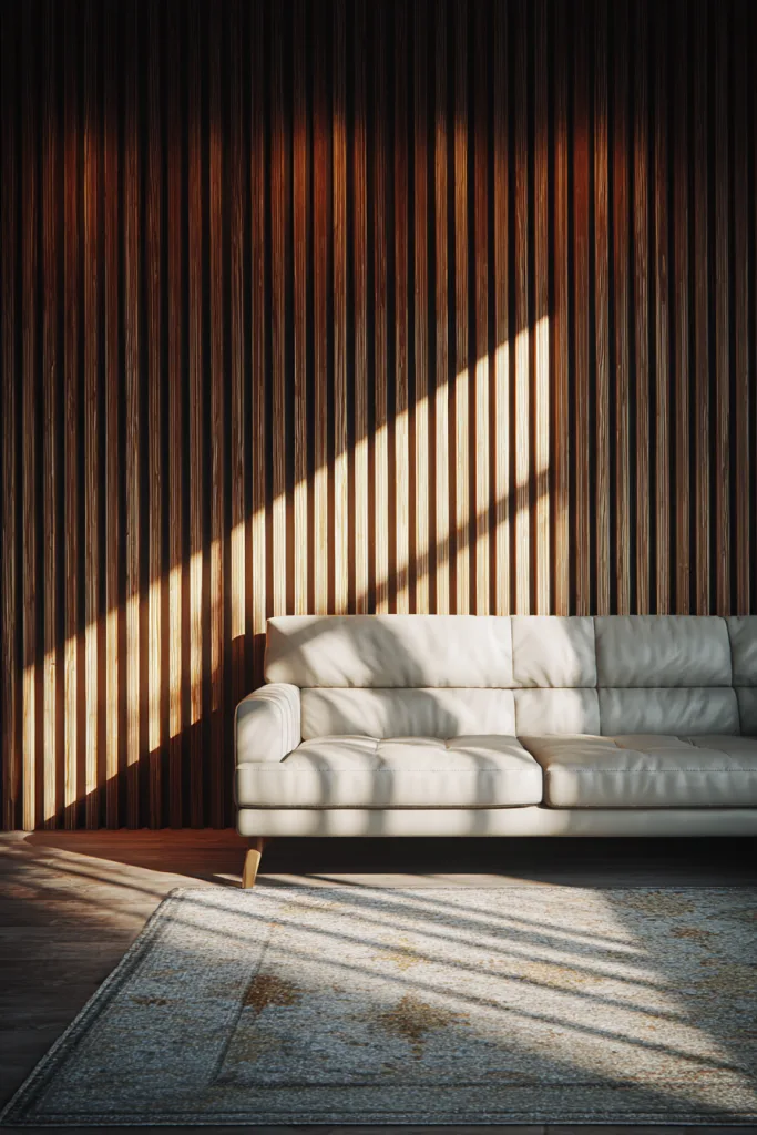
Wood accent walls range from painted shiplap to raw reclaimed planks to vertical slat paneling with gaps between boards, and each brings a different feel — shiplap reads as farmhouse-casual, dark-stained reclaimed wood reads as more dramatic, and slat paneling with visible gaps reads as contemporary.
Vertical slat paneling is worth calling out specifically, because the gaps between boards catch light and shadow differently throughout the day, adding depth that a flat panel doesn’t. If your floor is a warm tone like oak, choosing a slightly cooler wood tone for the wall, such as walnut or gray-washed wood, keeps the two from competing — though matching or complementary tones both work; it’s a matter of preference rather than a hard rule.
Designer tip: Pre-finish or seal reclaimed wood boards before installing them. Old wood can carry dust, old nails, or uneven moisture content that’s much easier to deal with on a workbench than after the boards are already on the wall.
4. Gallery Wall Art Displays
A Curated Alternative to a Single Statement Piece
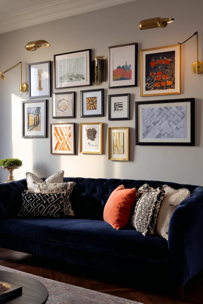
A dedicated gallery wall turns a collection of art, photos, and objects into the room’s focal point instead of relying on one large piece. Mixing frame styles with a shared color or material reads as eclectic and personal; matching frames throughout reads as more formal and cohesive — both work, but pick one approach rather than landing in between.
For a wall covering most of the surface, sometimes called a salon-style hang, start with your largest or most important piece placed at roughly eye level, then build outward, keeping consistent spacing — 2 to 3 inches between frames is a common starting point — so the grouping reads as one composition rather than a scattered collection.
Designer tip: Cut paper templates matching each frame’s dimensions and tape them to the wall before hanging anything. It’s tedious, but it turns “does this look right” into something you can actually see before committing to nail holes.
5. Built-in Shelving Systems
Storage That Doubles as the Wall’s Design
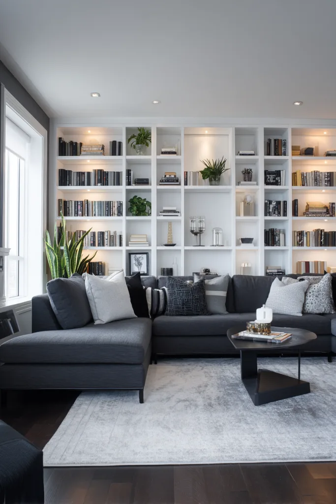
Built-in shelving turns an accent wall into functional storage, which matters if the room needs to hold books, media equipment, or a growing collection of objects without cluttering the floor. Floor-to-ceiling units make sense in rooms with higher ceilings; a horizontal run of shelves at a lower height suits a standard 8-foot ceiling better, since a floor-to-ceiling unit in a lower room can end up feeling like it’s pressing down on the space.
Mixing open shelving with a few closed cabinet sections gives you a place to display objects you want seen and hide the ones you don’t, like cables, chargers, and board games. If you’re building the shelving yourself rather than hiring it out, anchor heavier upper sections into wall studs, typically spaced 16 inches apart on center in most homes, rather than relying on drywall anchors alone.
Designer tip: Style shelves in small groupings of odd numbers, three or five items, at varying heights rather than evenly spaced single items — it reads as intentional rather than like a store display.
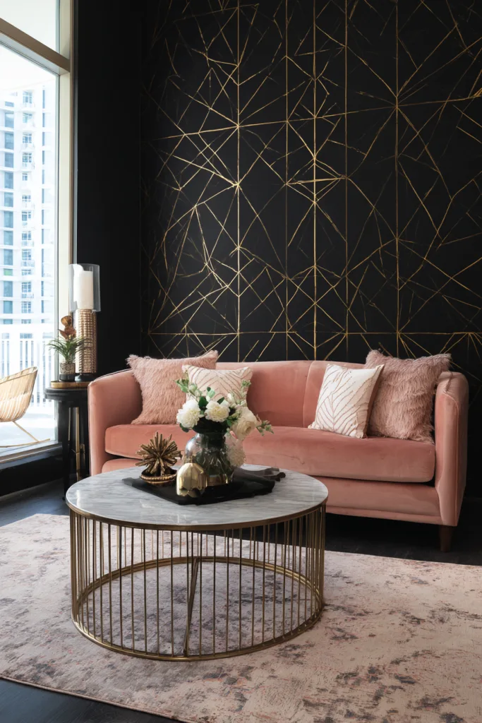
6. Wallpaper Feature Walls
Pattern and Color Without the Whole-Room Commitment
Wallpapering a single wall gets you a bold pattern — a large-scale floral, a geometric print, a metallic texture — for a fraction of the material cost of papering an entire room, which is exactly why it’s one of the more common ways homeowners try a pattern they’d hesitate to commit to everywhere. Textured wallpapers, like grasscloth or embossed prints, add subtle dimension in smaller rooms where a bold print might feel like too much.
Peel-and-stick wallpaper has gotten considerably better in recent years and is a practical choice for renters, or for anyone testing a pattern before committing to traditional paste-applied paper, though it generally doesn’t hold up as many years as professionally hung traditional wallpaper in a high-traffic spot.
Designer tip: Pull at least one color from the wallpaper into another part of the room, such as a throw pillow, a piece of art, or a lamp base, so the wall feels connected to the rest of the space rather than pasted on separately.
7. Fireplace Accent Walls
Building on a Focal Point You Already Have
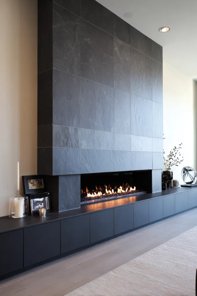
A fireplace already draws the eye, so extending its material treatment into a full accent wall, rather than stopping at the immediate surround, makes the fireplace look like part of the room’s architecture instead of a box someone attached to the wall afterward.
Traditional stone or brick extending floor to ceiling suits a classic fireplace; large-format tile, thin metal panels, or a smooth plaster or concrete finish suit a modern linear fireplace better. Whatever material you choose, check your fireplace manufacturer’s clearance requirements for combustible and non-combustible materials near the firebox and mantel before installing anything — those clearances exist for genuine safety reasons and vary by fireplace type, so the manufacturer’s documentation is the source to check rather than a general rule of thumb.
Designer tip: Extend the material at least to the ceiling, not just a foot or two above the mantel — a wall treatment that stops abruptly partway up tends to look unfinished rather than intentional.
8. Three-Dimensional Wall Panels
Sculptural Texture That Changes With the Light
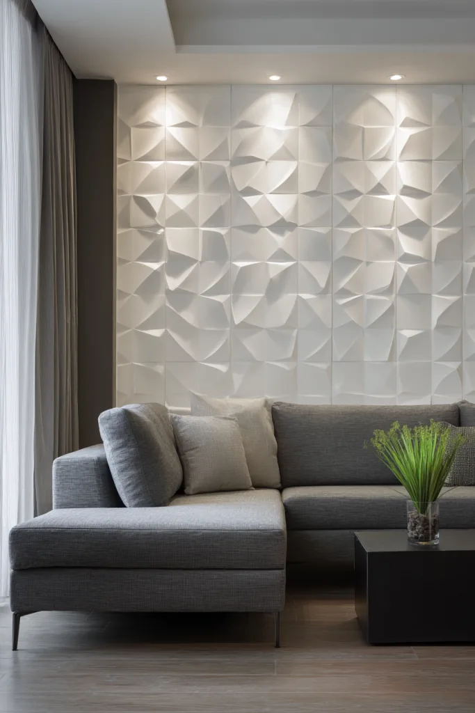
3D wall panels — geometric, wave-form, or fluted profiles — add real physical depth to a flat wall, which means the wall’s appearance actually shifts as daylight moves across it during the day, something a flat painted or papered wall can’t do.
Panels come in a range of materials and weights, from lightweight molded polyurethane or MDF, easier for a DIY install with adhesive and a few finish nails, to solid wood or metal versions that are heavier and usually better suited to a professional install. Because the whole appeal is the shadow the texture throws, panels placed in a spot with minimal directional light, with no nearby window or angled fixture, can end up looking flatter than expected — plan for at least one light source that hits the wall at an angle.
Designer tip: A single warm-toned uplight or wall washer aimed across the panel surface, rather than straight-on overhead lighting, does more to show off the texture than adding more overall room light.
9. Brick Accent Walls
Industrial Character From a Classic Material
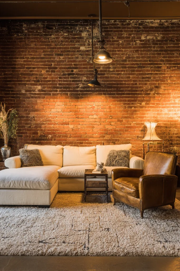
Exposed brick, whether it’s original masonry uncovered during a renovation or a newer brick veneer installed specifically for the look, adds color variation and texture that most other wall materials can’t match. Original brick typically needs cleaning and a masonry sealer to keep dust from shedding into the room and to stabilize old mortar joints.
Painting brick is a legitimate option, not a compromise — white paint over red brick reads as Scandinavian-farmhouse, while a dark charcoal or black paint reads as more dramatic and modern. Keep in mind that brick is naturally matte and light-absorbing, so a brick wall in a room with limited natural light can end up reading darker and heavier than expected; balancing it with lighter furniture and a few metallic or glass accents keeps the room from feeling dense.
Designer tip: If you’re painting brick, use a masonry primer first — regular wall primer doesn’t bond as well to brick’s porous surface and is more likely to peel over time.
10. Fabric and Textile Walls
Softness That Also Helps With Sound
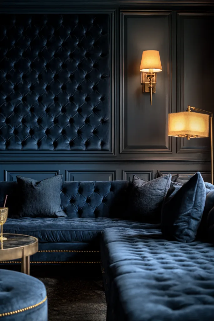
An upholstered accent wall, fabric stretched over padding and a wood frame and typically installed in panels, brings a texture no hard material can match, and it has a genuine practical side effect: soft, padded surfaces absorb sound rather than reflecting it, which can noticeably calm the echo in a room with hard floors and high ceilings.
Durability should drive the fabric choice more than pattern. Performance fabrics, rated for abrasion and stain resistance, hold up best in a high-traffic living room; velvet and linen look and feel great but show wear faster in spots that get regular contact. Keep upholstered walls away from fireplaces, radiators, or anywhere with regular moisture exposure, since fabric doesn’t tolerate heat or damp the way hard materials do.
Designer tip: Panel the wall in individual upholstered squares or rectangles rather than one continuous piece — it’s much easier to remove and replace a single damaged panel than to redo an entire fabric wall.
11. Mixed Media Combinations
Layering Materials Without Creating Visual Noise
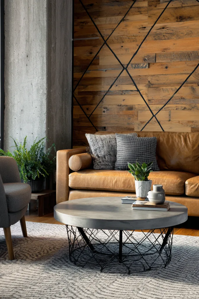
Combining two or three materials on one wall — wood paneling with a stone insert, painted drywall with a metal accent strip, tile with a wood shelf — creates more visual richness than any single material alone, but it’s also the easiest accent wall approach to overdo.
The trick that keeps a mixed-material wall from looking chaotic is letting one material clearly dominate, roughly 70-80% of the visible surface, while the others act as accents, and sticking to a narrow, coordinated color palette across all the materials involved so the combination reads as one deliberate choice rather than several unrelated decisions layered on top of each other.
Designer tip: Sketch or tape off the rough proportions of each material on the wall before ordering anything — it’s much easier to catch a lopsided split on paper, or painter’s tape, than after the materials are already installed.
12. Mirror and Reflective Surfaces
Using Reflection to Open Up a Smaller Room
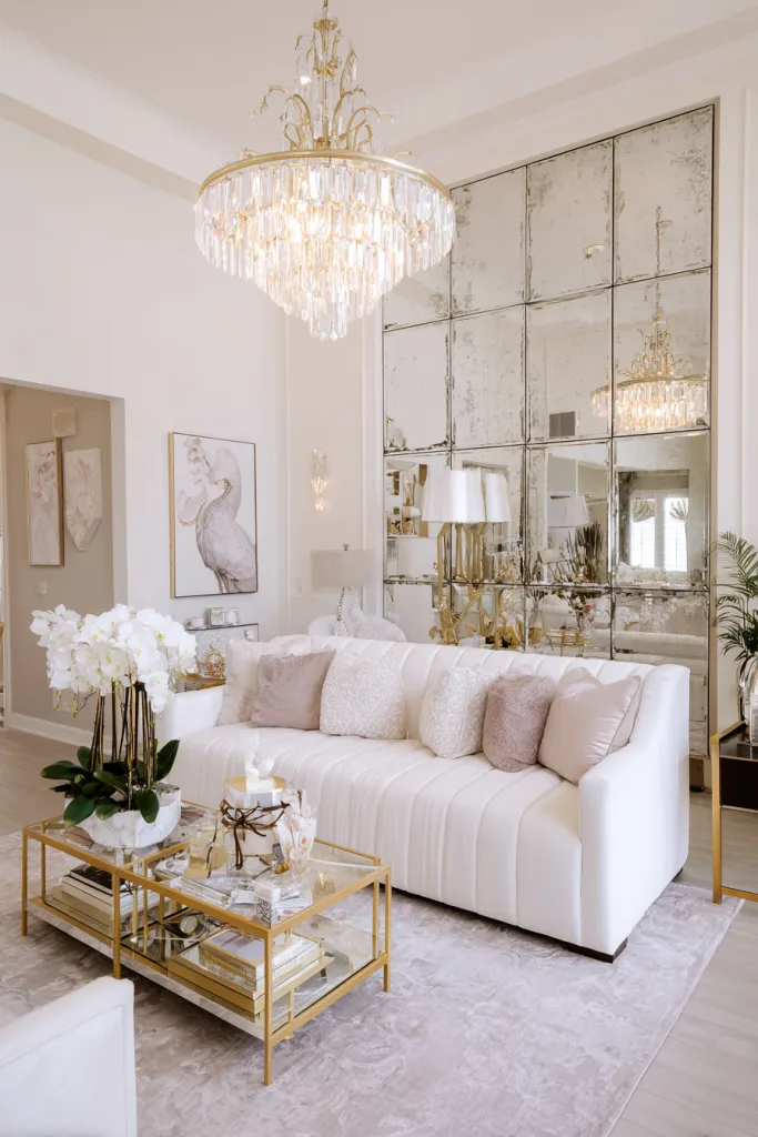
A large mirror or a mirrored panel wall reflects both light and the room itself, which can make a small or dim living room feel noticeably more open — though the effect depends entirely on what the mirror is reflecting. A mirror positioned to reflect a window, a bright wall, or an attractive view adds real light and depth; one that reflects a cluttered corner or the back of a sofa just doubles the clutter.
Large single-panel mirrors read as clean and modern; a grouping of smaller mirrors in varied shapes and frames reads as more eclectic. Either way, check where light from windows or fixtures will bounce off the mirror before hanging it — a mirror positioned to throw afternoon sun or a reading lamp straight into the main seating area creates glare rather than ambiance.
Designer tip: Hang large or heavy mirrors on D-ring hardware anchored into a wall stud, not on the hook-and-wire hanging kit some mirrors ship with — the shipped hardware is often rated for far less weight than the mirror actually is.
Bringing It Together
The strongest accent walls share one thing regardless of material: they’re chosen for a wall the room already draws attention to — behind the main seating, facing the entry, or around a fireplace — rather than picked at random and hoped into becoming a focal point.
If you’re not sure where to start, paint is the lowest-risk way to test a bold decision before committing to material or labor costs that are harder to undo. From there, the other approaches on this list are really just different ways to add more permanent texture, once you know the color and mood that work in the room.
Frequently Asked Questions
How much does it typically cost to create an accent wall?
Cost depends heavily on material. A DIY painted accent wall is usually the cheapest option, often well under $200 in paint and supplies for a standard living room wall. Wallpaper, including peel-and-stick, typically falls in the low hundreds for materials, more with professional installation. Wood paneling and thin stone veneer are a step up, often running from several hundred to a couple thousand dollars depending on material and wall size. Full natural stone, custom built-ins, and upholstered walls are the biggest investments, frequently running several thousand dollars once installation is factored in.
Which wall should I choose as my accent wall?
The wall that naturally draws attention when you walk into the room is usually the right one — often the wall behind your main seating, the one with the fireplace, or the one directly facing the room’s entrance. Walls broken up by multiple windows, doors, or awkward angles tend to make a poor choice, since the treatment gets visually interrupted.
Can accent walls work in small living rooms?
Yes, though the material and color matter more in a small room. Lighter colors and reflective materials like mirrors tend to open up a small space, while very dark colors or heavy textures can make it feel smaller and more closed-in. That’s not a hard rule, since some small rooms actually read as cozier with a dark wall rather than closed-in, but it’s worth testing with a sample before committing an entire wall to it.
How do I coordinate my accent wall with existing furniture?
Start from your room’s existing color palette and pick a wall treatment that complements it rather than fights it. If your furniture already has a bold pattern or color, keep the wall treatment simpler; if your furniture is mostly neutral, the wall has more room to carry pattern or color. Echoing the accent wall’s color in a few small pieces elsewhere in the room, like pillows, art, or a lamp, usually ties the whole space together better than leaving the wall as an isolated decision.