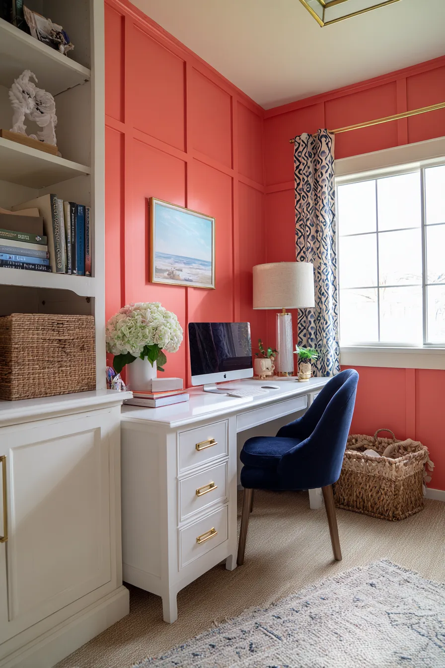
Board and batten is a wall treatment built from vertical strips (battens) applied over a flat panel or directly onto drywall, usually paired with a horizontal rail along the top. Traditionally it sits at chair-rail height, roughly 32 to 36 inches from the floor, though full-height, floor-to-ceiling versions have become just as common in bedrooms and hallways. What makes it worth the weekend is that it changes how a wall reads without changing the room’s size: it adds shadow lines, texture, and a sense of built-in millwork for a fraction of the cost of custom carpentry.
The construction itself is straightforward. Battens are typically 1×2, 1×3, or 1×4 boards, either primed pine or MDF. MDF is cheaper and sands to a smoother, more seamless finish once caulked and painted, but it doesn’t hold up to moisture, so skip it in bathrooms or laundry rooms unless you’re using an MDF product rated for those spaces. Spacing between battens usually runs 12 to 16 inches on center for a traditional, tightly ribbed look, or 18 to 24 inches for a more minimal, modern feel with fewer seams to caulk. Material costs for a mid-size wall, around 10 linear feet, in basic primed MDF typically land in the low hundreds of dollars before paint; hiring it out adds labor on top of that, which is usually the larger share of the bill.
Below are 12 board and batten looks that cover the styles people search for most, from classic white to bold color choices, plus the practical details, color pairing, room fit, and what to watch for, that make each one work in a real house instead of just a photo.
1. Classic White at Traditional Rail Height
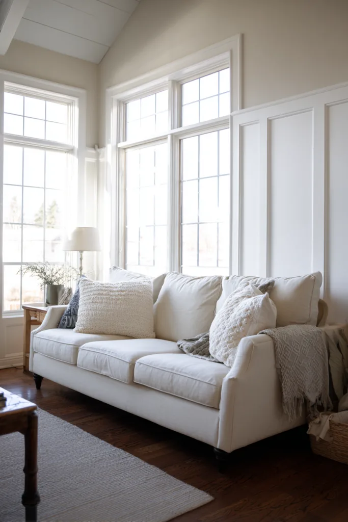
White board and batten at the classic 32 to 36 inch rail height is the safest starting point and the easiest to resell or repaint later since it works with almost any furniture style. Because every seam and nail hole shows more clearly under a flat, single color like white, caulking quality matters more here than with a busier palette. Run a bead along every seam before priming, let it skin over, then sand lightly so the batten edges disappear into the wall rather than reading as applied trim.
Skip stark white if the room gets a lot of natural light, since it can look clinical; a warmer off-white or antique white softens the effect while still reading as white from across the room. This treatment pairs well with natural wood furniture, jute or wool rugs, and brass or black hardware, and it’s the one variation on this list where a satin or eggshell finish, rather than semi-gloss, looks intentional instead of flat.
2. Moody Navy for a Dramatic Focal Wall
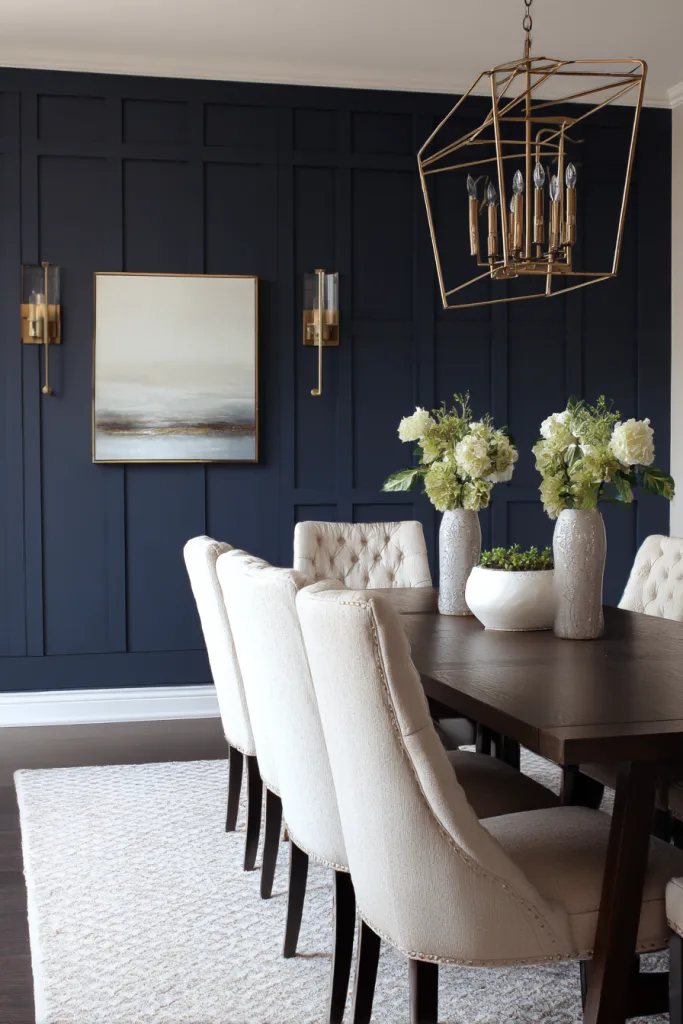
Navy works best as a single focal wall rather than a full room treatment. The depth of color and the battens together add visual weight fast, so most navy board and batten rooms use it on one wall, often the one behind a bed or dining table, while the surrounding walls stay white or a light neutral. A slightly wider batten, closer to 3 or 4 inches, tends to read better in dark colors than a narrow one, since narrower strips can start to look busy once you lose the contrast a lighter color provides.
Because dark, flat paint shows roller marks and touch-up patches more than white does, use at least a satin finish and plan on two full coats even over a tinted primer. Navy pairs naturally with brass or unlacquered hardware, warm wood tones, and cream textiles; the warmth in the surrounding materials keeps the wall from feeling cold.
3. Sage Green for a Calm, Grounded Look
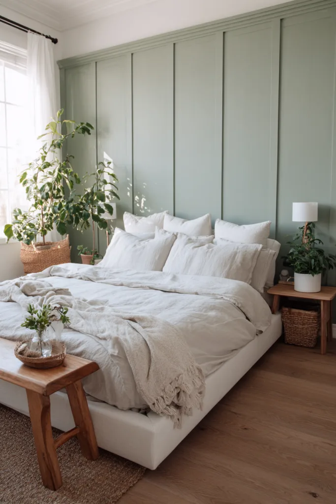
Sage and other muted, gray-leaning greens have stayed popular because they split the difference between a neutral and a real color choice. They read as calming in a bedroom without feeling like a themed room the way a brighter green might. If you want something softer still, a pale mint or celadon in the same family gives a lighter version of the same effect and shows less contrast against white trim, which helps in a small room where you don’t want the batten lines to dominate.
This is a good candidate for a matte or eggshell finish rather than semi-gloss; muted greens tend to look chalkier and more intentional without shine, and a lower-sheen finish also hides minor drywall or seam imperfections better. Pair it with rattan, linen, and light wood tones for a look that leans natural rather than dressed-up.
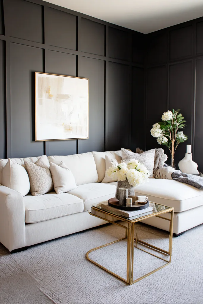
4. Charcoal Gray for Modern Sophistication
Charcoal gives you most of the drama of black with more flexibility, since it reads as a neutral in more lighting conditions and doesn’t absorb light quite as aggressively in a room with limited windows. It works well full-height in a home office, or as a rail-height treatment in a living room with white trim above for contrast; the white break keeps the room from feeling boxed in.
As with any dark color, batten seams and nail holes need real attention. Fill nail holes with a paintable filler rather than caulk alone, sand flush, and prime before the topcoat so the filler doesn’t flash a different sheen under the paint. Charcoal pairs with almost anything metallic, brass, matte black, or brushed nickel all work, which makes it one of the more forgiving dark choices if you haven’t settled on hardware yet.
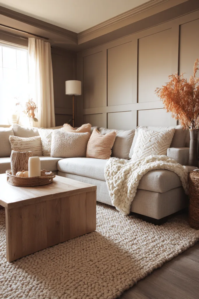
5. Warm Taupe or Greige for Understated Warmth
Taupe and greige, a gray-beige blend, solve a real problem: they give a room warmth the way beige does, without going yellow or dated the way older beige paints tended to. It’s a lower-risk color for a full room rather than a single wall, since it stays close enough to neutral that it won’t fight with existing furniture or flooring the way a stronger color might.
Because the color has so little contrast with itself, texture is what carries this look. Pull in a mix of matte and slightly textured finishes, linen throws, a jute rug, unlacquered brass, so the room doesn’t read as flat. It’s also a practical choice if you might want to redecorate again in a few years, since taupe walls work as a backdrop for almost any accent color layered on top later.
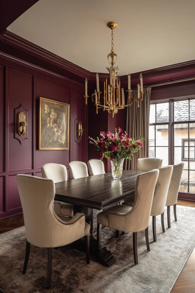
6. Rich Burgundy for a Jewel-Toned Statement
Burgundy and other deep jewel tones, like forest green or deep plum, work best in rooms used mostly in the evening, dining rooms, libraries, home studies, where the color reads as rich rather than heavy since the space doesn’t depend on daylight to feel balanced. It’s a color that benefits from a semi-gloss finish more than most others here, since the sheen catches light and keeps the wall from feeling like a dark hole once the sun goes down.
Keep the trim and ceiling white or a very light cream to give the eye a place to land; an all-burgundy room with dark ceiling and trim can feel closed in fast. This is also one of the pricier colors to fully cover if you change your mind later, since deep reds often need a stain-blocking primer on repaint, so it’s worth living with a sample on the wall for a few days before committing to the whole room.
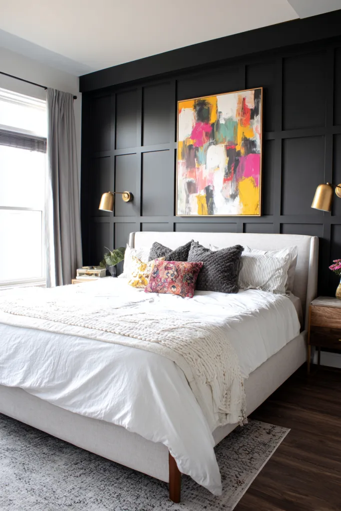
7. Black as a Bold Accent Wall
Black is the highest-commitment color on this list, which is exactly why it works best as one accent wall rather than a whole room. A single black board and batten wall creates a real focal point, especially behind a bed or the wall a room’s main furniture piece backs onto, without making the whole space feel smaller. Warm, layered lighting, table lamps, sconces, dimmable overheads, does more work in a black room than in any other color here, since flat overhead light alone can make it feel dead instead of dramatic.
Matte or flat black is more forgiving of imperfect drywall than a glossier sheen, which will show every ripple. Brass, gold, or warm wood against black reads as intentional and elevated; leaning entirely cool-toned, chrome, gray, tends to read colder than most people want. This is a wall to caulk especially carefully, since every unfilled seam shows as a hard shadow line against flat black.
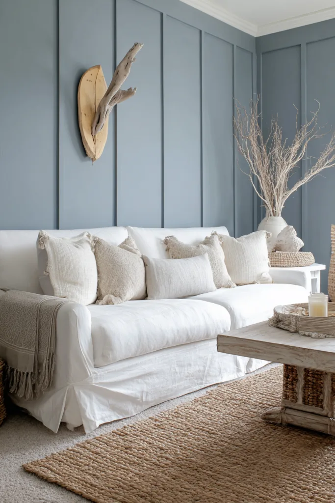
8. Dusty Blue for Coastal-Inspired Calm
A grayed-out, muted blue avoids the literal beach-house theming of brighter turquoise or navy-and-white nautical stripes while still reading as calm and airy. It works well in bedrooms and living rooms; for a bathroom, stick to solid wood or a moisture-resistant board rather than standard MDF, since even a well-ventilated bathroom sees enough humidity over time to swell untreated MDF at the seams.
Pair dusty blue with natural wood tones, off-white, and woven textures, jute, rattan, linen, rather than crisp white and chrome, which can push the look too far into a generic coastal theme. A warm brass or wood accent keeps the palette from feeling cold, which is the main risk with any blue-gray in a room with limited natural light.
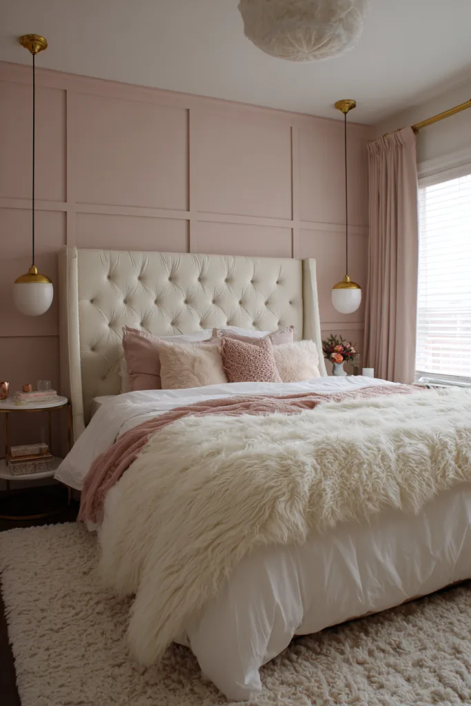
9. Blush Pink for a Soft, Romantic Bedroom
The difference between a blush that reads as sophisticated and one that reads as juvenile usually comes down to undertone. A dusty, grayed rose works in an adult bedroom or nursery in a way that a brighter bubblegum pink typically doesn’t. It’s a strong nursery choice specifically because it isn’t locked to gender-specific decor the way a brighter pink often is, and it repaints easily to a different accent color later without much prep.
Pair it with warm metals, brass or gold rather than chrome, cream or oatmeal textiles, and a deeper accent color like forest green or navy in artwork or pillows for contrast; an all-pink room with no darker anchor color can start to feel flat. Because this is a lighter color, seam and nail-hole prep matters less than it does with the dark options above, which makes it a reasonable first board and batten project if you’re installing it yourself.
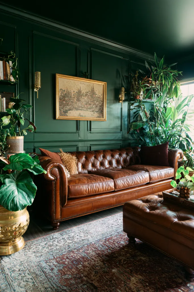
10. Forest Green for Grounded, Organic Depth
A deep forest or hunter green gives a room the enveloping, cocoon-like feel that navy and charcoal also offer, but it reads warmer and more organic since it pulls associations from wood and plants rather than stone or denim. It works well full-height in a den, library, or dining room where you want the walls to feel like part of the furniture rather than a backdrop.
Brass hardware, leather furniture, and real or faux wood tones are the natural pairing here; the warmth in those materials keeps a dark green room from feeling cold the way a dark blue-gray sometimes can. As with the other dark colors on this list, plan for real prep work: fill and sand nail holes, caulk every seam, and use at least a satin finish so the color reads as intentional rather than flat.
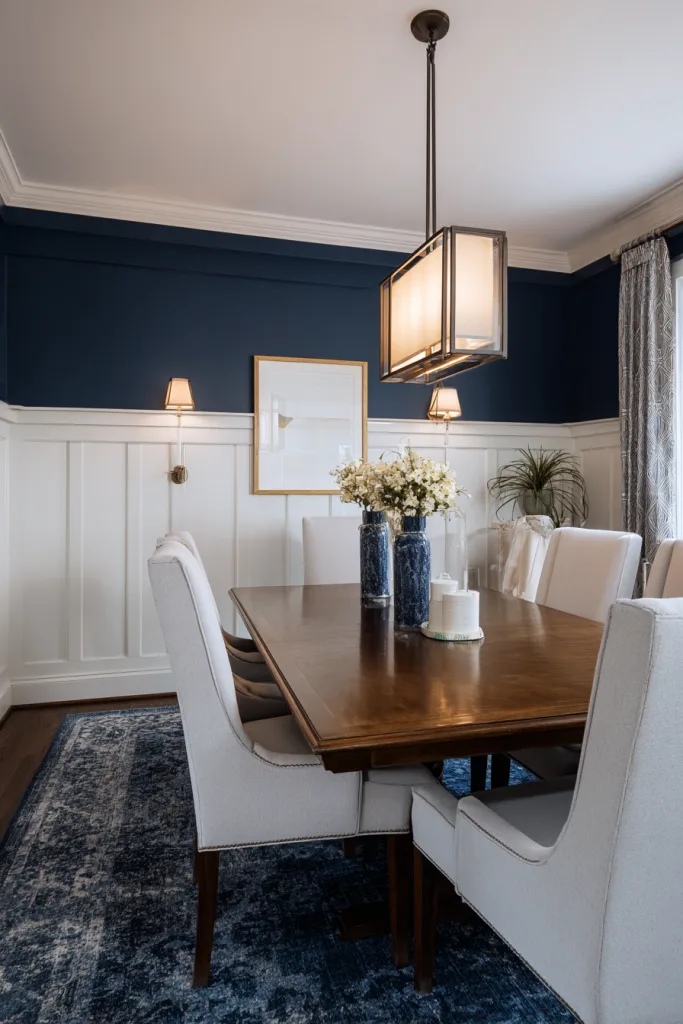
11. Two-Tone Walls: Paint Below, Color or Paper Above
A two-tone wall, white or a light neutral on the batten portion with a bolder paint color or wallpaper above the rail, is one of the more technically demanding but highest-payoff variations, since it gives you architectural detail and a color statement without covering the whole wall in a strong color. The rail itself, the horizontal board that caps the battens, becomes a real sightline, so it needs to be level before anything above or below it gets painted. Even a small amount of drift is obvious once two colors meet at that line.
Classic pairings include white below with navy, sage, or a patterned wallpaper above. For a lower-maintenance version, keep both zones painted rather than adding wallpaper, since wallpaper above a batten line means precise cutting around the top rail. This treatment works especially well in entryways and dining rooms, where the extra visual layering reads as more finished without needing much additional furniture or art.
12. Natural or Stained Wood, Left Unpainted
Skipping paint altogether and staining or clear-coating the battens shows off the wood grain instead of hiding it, which changes the material math: you’ll want a wood species with a grain pattern you actually like, pine, poplar, or oak are common choices, with pine the cheapest and oak the most expensive, since MDF has no real grain and looks flat under a clear finish or stain. That rules out the budget-friendly MDF option that works for every painted look above.
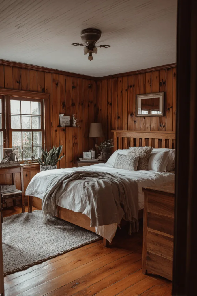
Lighter stains, natural, honey, whitewash, read as casual and Scandinavian-influenced; darker stains, walnut, espresso, read as more traditional or cabin-like. Either way, seal the wood with a clear polyurethane or wax after staining, since bare stained wood scuffs and marks more easily than painted MDF. This is a good option for a mudroom, entry, or den where you want warmth and durability rather than a crisp, painted look.
Choosing the Right Style for Your Room
Light, low-contrast colors, white, taupe, blush, are the safest choice for a full room or a space you’ll want to easily repaint later, since they need less seam and nail-hole prep and don’t lock you into a strong color statement. Dark, saturated colors, navy, charcoal, black, burgundy, forest green, work best as a single accent wall unless the room gets strong natural light, since they add visual weight fast. If you’re unsure about a color, paint a large sample board and prop it against the wall for a few days before committing. Board and batten is more work to redo than a plain painted wall, since changing your mind also means re-filling nail holes and re-caulking seams.
Whichever look you choose, the construction basics matter more than the color: a level top rail, consistent batten spacing, and thoroughly caulked seams are what make the finished wall look like built-in millwork instead of applied trim. Get those right first, and the color choice becomes the easy part.
Frequently Asked Questions
How much does board and batten cost to install?
Material costs depend heavily on the size of the wall, the batten material, and your region, but as a rough rule of thumb, a mid-size wall around 10 linear feet in primed MDF battens, adhesive, and paint commonly runs in the low hundreds of dollars in materials alone. Real wood battens cost more than MDF. Hiring a carpenter adds labor on top of materials, which is usually the larger part of a professional quote, so it’s worth getting a couple of local quotes if you’re comparing DIY against hiring it out.
What’s the best paint finish for board and batten?
Satin or semi-gloss finishes are the most common choice because they’re washable and hold up to bumps and fingerprints better than flat or matte paint, which is useful on a trim-heavy wall that gets touched more than a plain one. That said, matte and eggshell finishes hide minor drywall and seam imperfections better than higher-sheen paint, so in a low-traffic room like a formal living room or a bedroom, a lower sheen is a reasonable trade-off.
Can board and batten work in a small room?
Yes, with a few adjustments. Lighter colors reflect more light and keep a small room from feeling boxed in; keeping the treatment to rail height rather than full-height leaves breathing room above; and using it on one accent wall rather than all four limits how much visual weight the battens add. Narrower, closely spaced battens can start to feel busy in a tight space, so wider spacing, 18 to 24 inches, with slightly wider boards often reads better in a small room than tight, traditional spacing.
What height should the batten rail sit at?
The traditional chair-rail height is roughly 32 to 36 inches from the floor, which lines up historically with where chair rails were installed to protect walls from furniture. Full-height, floor-to-ceiling board and batten has become a common modern variation, especially in bedrooms, entryways, and mudrooms, where it reads as a more architectural, built-in look rather than a decorative accent. There’s no single correct height; it depends on the room’s proportions and whether you want the batten to read as a full wall treatment or a lower accent.