Neutral bathrooms do not need more beige; they need better contrast. The useful distinction in neutral bathroom design is between color neutrality and visual neutrality: a room can use beige, white, or gray yet still feel flat if every surface has the same sheen, scale, and texture. Evaluate samples together under the bathroom’s actual lighting, then balance quiet colors with deliberate contrast in grout, hardware, timber, stone veining, and surface texture while treating waterproofing, slip resistance, and cleaning needs as design constraints rather than afterthoughts.
That is the principle behind useful neutral bathroom inspo. As a renter-first decorator, I also add one strict test: every change should come off the wall cleanly, or remain reversible with a clear plan for patching and touch-up.
Key Takeaways
- Check undertones and sheen together in the bathroom’s real light before committing to finishes.
- Use texture, grout contrast, timber, and one controlled metal finish to keep pale schemes from looking flat.
- Protect the room’s calm appearance with compatible waterproofing, suitable wet-area flooring, ventilation, and a cleaning plan.
What Neutral Bathroom Design Actually Means
Color neutrality is not visual neutrality
A neutral palette usually sits among warm whites, creamy greiges, soft taupes, stone hues, and cool grays. Those colors are quiet, but quiet does not mean interchangeable. Warm beige can sit awkwardly beside a blue-white basin, while a green-gray tile may make a clean gray paint look faintly violet by comparison.
Neutral finishes still have undertones, and adjacent undertones can clash even when the finishes look similar in isolation. The safest method is to gather the floor, wall tile, vanity sample, countertop sample, grout card, and hardware finish in one group, then inspect them in morning, daytime, and evening light.
Do not judge a sample against a white screen or a brightly lit showroom wall. Hold it beside the existing bath, trim, door, and ceiling, because those fixed surfaces are part of the palette whether you planned them or not.
Warm, cool, and green-leaning schemes
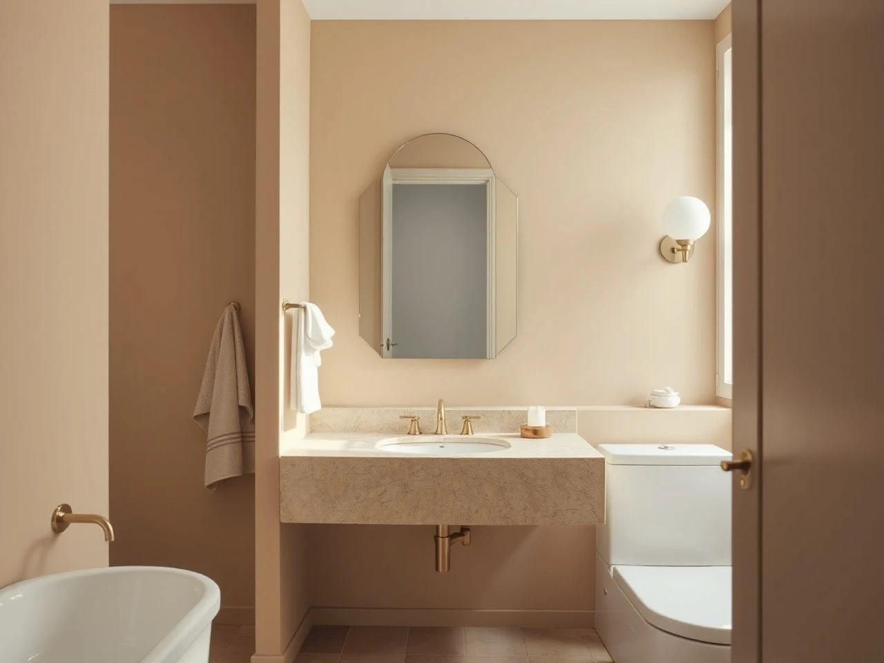
Warm neutrals contain a visual pull toward cream, sand, tan, or soft taupe. They suit white oak, honed marble with warm veining, limestone, and aged-looking metal finishes, although the exact combination still needs checking in the room itself.
Cool neutrals lean toward blue-white, blue-gray, or crisp gray. They can look composed with porcelain tile, chrome, or gray grout, but too many cool surfaces may make a small bathroom feel hard and reflective. A green-gray neutral is especially changeable because surrounding white and artificial light can bring out its green cast.
Light Reflectance Value describes how much light a color reflects into a space. A pale finish can help a compact bathroom feel more open, yet high reflectance does not solve a room with no texture or contrast.
Renter-first decisions
Start with changes that do not disturb tile, waterproofing, paint, or cabinetry. A removable mirror solution, freestanding timber stool, washable textile, framed art hung from an existing point, and a carefully chosen soap dispenser can shift the character without drilling into a wet wall.
For mirror planning, a renter-focused guide to bathroom mirrors that suit rental bathrooms can help you think through scale and placement without treating a permanent installation as the default. The mirror should relate to the basin and light source, not merely fill the largest empty wall.
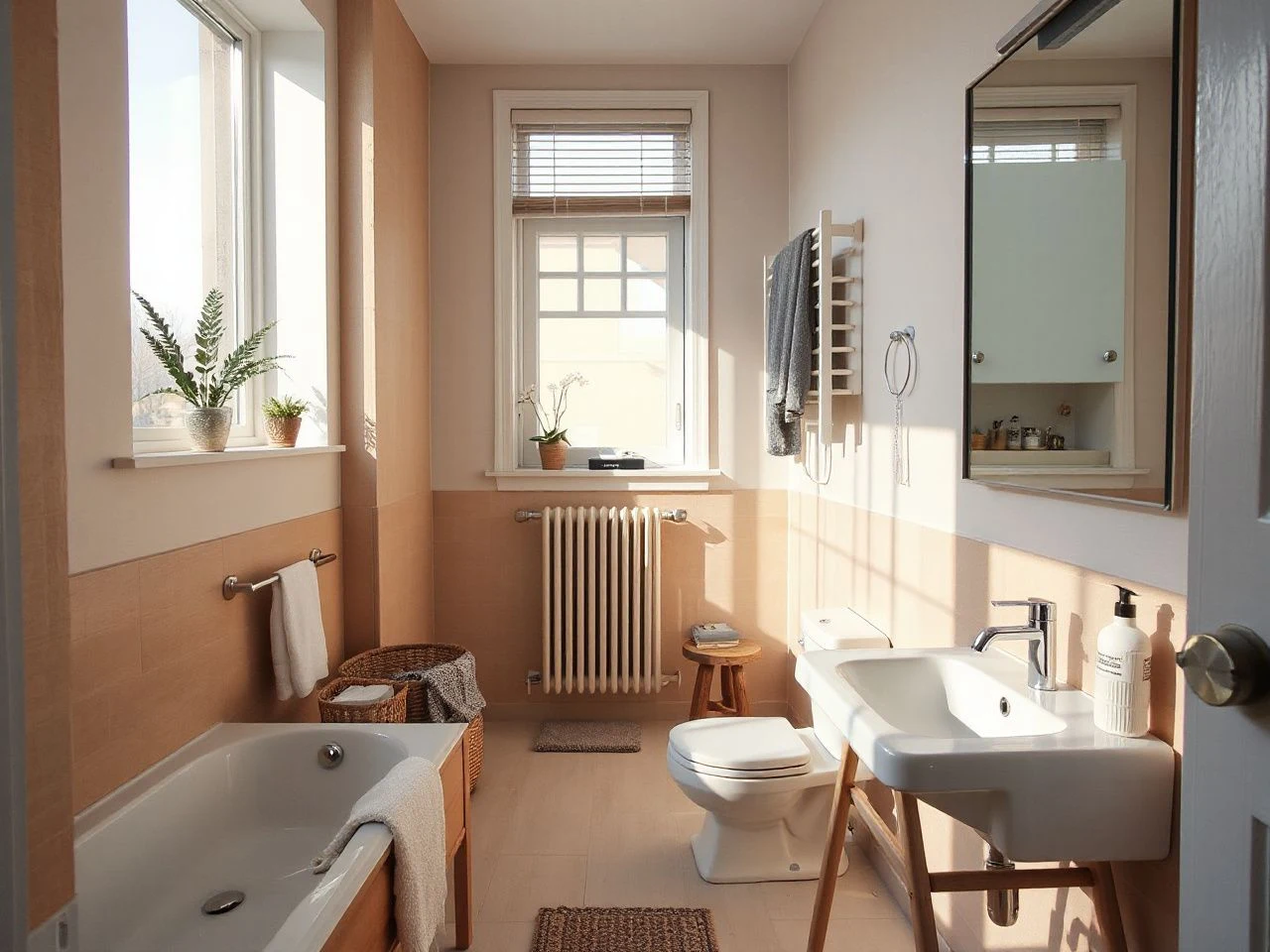
Neutral Bathroom Inspo by Surface
Floor, shower wall, vanity, and countertop
The floor, shower walls, vanity, and countertop should support one another rather than match exactly. Repeating one neutral across every surface can erase depth, especially if the materials also share a polished finish.
A coordinated bathroom palette usually needs variation in at least one of color, texture, scale, or sheen. For example, a quiet porcelain floor can sit beneath a lightly veined honed marble counter, a plain painted vanity, and a subtly textured shower wall. The colors remain related while the surfaces do different visual work.
Large, quiet wall surfaces can make a small bathroom feel less broken up, while a smaller floor format may provide more visual detail and a useful change in scale. Do not select a floor solely because the sample looks calm; wet-area flooring must also be considered for slip resistance under the relevant testing and installation conditions.
Porcelain tile, marble, limestone, and terrazzo
Porcelain tile is often the more straightforward choice for a low-maintenance neutral scheme because the material can provide a consistent, quiet field without the care demands associated with some natural stone. The tile and grout still need appropriate cleaning, and the installation still needs a sound wet-area assembly.
Natural stone changes the maintenance conversation. Honed marble can bring soft movement and a refined matte surface, while limestone contributes a chalky, earthy quality. Both can etch or stain, and both may require sealing; acidic cleaners and incompatible grout or setting materials can damage the finish.
Terrazzo adds texture through aggregate rather than a strong printed pattern. Its visual movement may be gentle or pronounced, so place a real sample next to the proposed grout, cabinet color, and wall finish before treating it as a quiet background.
Marble and limestone require a cleaning and sealing plan because porous or reactive stone can change appearance when exposed to unsuitable products. If the bathroom needs a simple routine and easy replacement, a restrained porcelain tile scheme may be easier to manage than a stone-led one.
Grout is part of the design
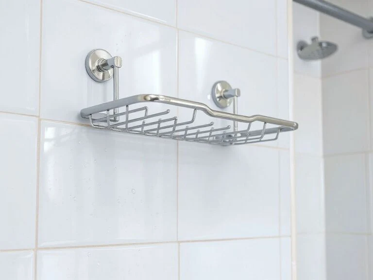
White grout can make pale tile look crisp, but discoloration, soap film, and water spots show clearly against a very light joint. Dark grout creates stronger definition and may frame a pale tile, although it can also make a small wall feel more graphically busy.
Match grout to the actual tile undertone rather than defaulting to pure white. A warm off-white joint can support creamy tile, while a cool gray joint may suit blue-white porcelain; neither choice should be made from a tiny printed card alone.
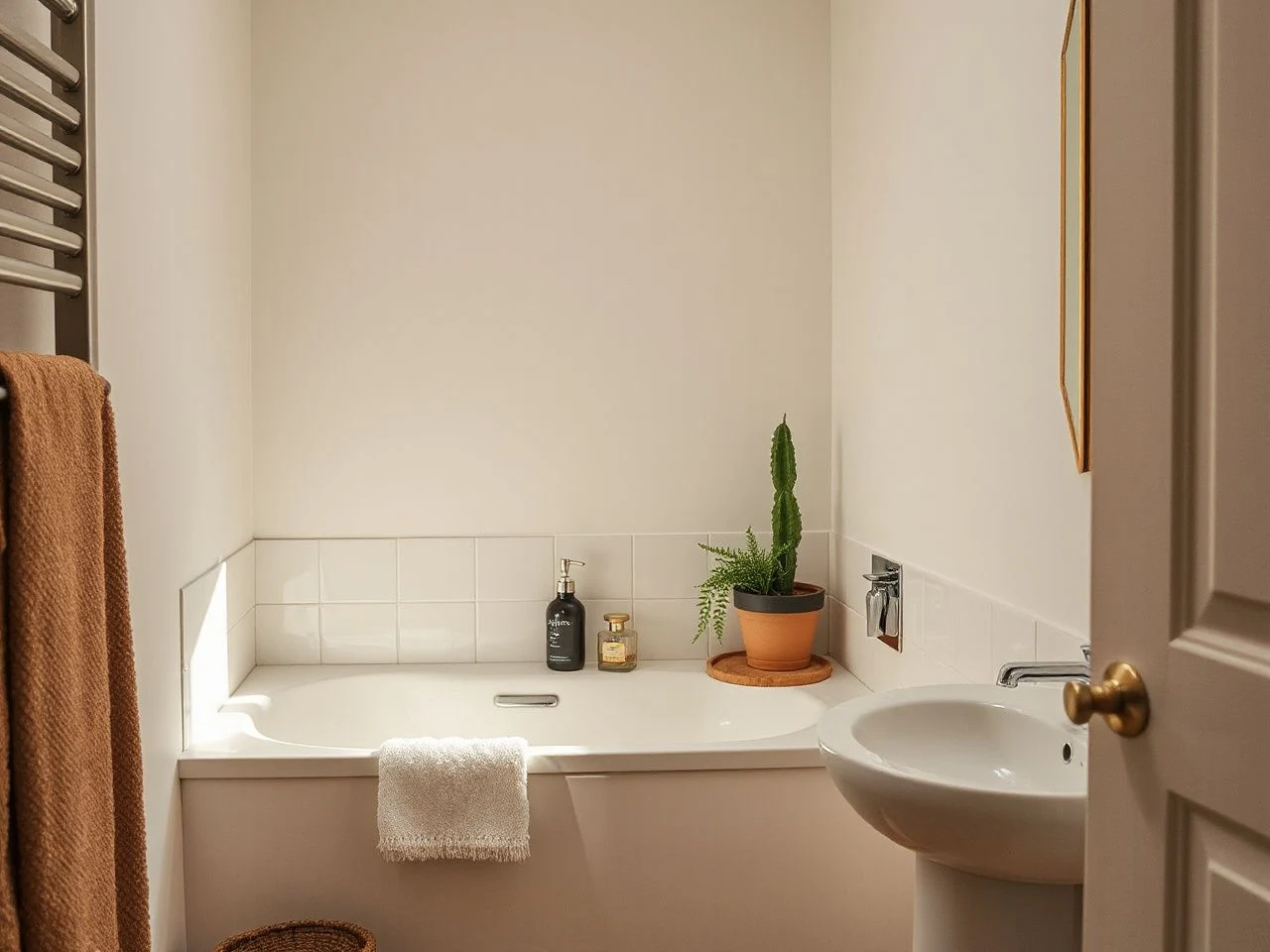
Texture, Hardware, and Lighting Without Visual Noise
Adding warmth without adding pattern
Texture gives a neutral room interest without requiring a loud decorative motif. White oak can introduce a quiet grain at the vanity or in a movable stool, while honed marble, limestone, brushed metal, woven fabric, and lightly ridged tile each contribute a different surface response.
White oak adds warmth through grain and tone, so it can soften a pale bathroom without introducing a strong pattern. In a rental, use timber in removable or freestanding pieces unless the existing vanity already provides it. Keep the number of competing textures controlled: a grainy timber beside heavily veined stone and patterned tile may no longer feel calm.
Terrazzo can work as the one busier surface in an otherwise restrained room. Herringbone floor tiles can also harmonize with natural marble veining, but the arrangement creates direction and should be balanced with simpler walls and accessories.
Choosing brushed nickel, brass, chrome, or matte black
Brushed nickel is a flexible bridge between warm and cool neutrals because its softened surface does not shout for attention. Chrome reads brighter and more reflective, so it can reinforce a crisp white or cool gray scheme. Brass brings warmth and should be checked beside beige, oak, and stone for an intentional relationship rather than added as a last-minute accent.
Matte black supplies the strongest contrast. It can outline a pale scheme effectively, but repeated black details may become the dominant feature in a small bathroom. Choose one main metal language for fixed hardware, then let removable accessories echo it lightly rather than creating a collection of competing finishes.
Brushed nickel, brass, chrome, and matte black each change the perceived temperature and contrast of a neutral bathroom. The right finish is the one that supports the undertones already present instead of asking the room to accommodate a new color family.
Lighting and evening color shifts
Bathroom lighting can make the same beige appear yellow, gray, or pink at different times. Test samples with the installed lights on and with daylight present, because the room’s actual illumination matters more than a general label such as warm or cool.
Place light where faces are evenly visible rather than relying on one strong source above the mirror. The exact fixture arrangement depends on the existing wiring and rental restrictions, so reversible changes may include replacing a shade where permitted, using a removable lamp in a dry zone, or adjusting the mirror position without moving electrical work.
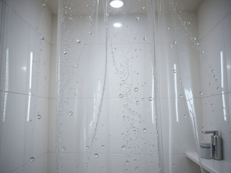
Lighting also affects maintenance visibility. Strong side light can reveal water spots and streaks on glossy tile, while a low-contrast scheme may make grout discoloration less obvious until it has spread.
Wet-Area Planning, Cleaning, and Long-Term Calm
Tile and grout are not waterproofing
Tile and grout form the visible surface, not the complete waterproofing system behind a shower. A shower assembly needs a continuous, compatible waterproof membrane with correctly treated corners, seams, penetrations, and transitions.
The Schluter-KERDI waterproofing system is one named system that can be researched alongside the project specification, but a product name does not replace correct design and installation. The Tile Council of North America Handbook is another useful reference point for installation methods and wet-area details.
A tiled shower can still suffer moisture damage if the waterproof membrane, corners, seams, penetrations, or transitions are not correctly treated. Renters should not drill, cut, or modify a shower assembly without written permission and a clear agreement about responsibility.
Slip resistance and accessible planning
Wet floors deserve a separate decision from wall appearance.
Do not infer safe wet-floor performance from a tile’s color or from a matte appearance alone. Ask for the relevant technical information from the installer or supplier, and make sure the selected application matches the testing conditions.
Universal design and accessible bathroom planning also affect layout, clearances, transitions, and hardware position. The ADA Standards for Accessible Design provide a formal reference for covered public and commercial settings; private homes may follow different requirements, but the principles can still inform safer, more usable planning.
Ventilation and moisture control
A calm-looking bathroom needs adequate exhaust ventilation, correctly sized and ducted to the exterior where required. Pale grout, timber, paint, and porous finishes make moisture problems easier to notice, but visible staining is a late signal rather than a design feature.
Use the exhaust system during bathing and allow the room to dry afterward according to the property’s controls and instructions. In a rental, report persistent condensation, peeling paint, musty odors, or recurring grout discoloration instead of covering the signs with new decor.
Exterior-ducted exhaust ventilation helps limit the moisture load that can affect grout, timber, paint, and porous finishes. No neutral palette can compensate for an unresolved leak or inadequate moisture management.
Cleaning and sealing by material
Porcelain tile generally supports a simpler cleaning routine than porous natural stone, but grout remains a maintenance point. Use cleaning products compatible with the tile, grout, sealant, and stone, and avoid assuming that a neutral color is tolerant of every chemical.
Marble and limestone can etch from acidic products, while sealing may need renewal according to the material and installation guidance. Terrazzo also deserves material-specific care because its binder and aggregate composition affect how it should be cleaned and protected.
Soap film and water spots show more strongly on very pale or glossy finishes because deposits create visible contrast against the clean surface. A less reflective surface may soften that contrast, but no finish removes the need for ventilation and regular cleaning.
Small Updates That Keep a Rental Neutral
Start with the fixed finishes
Before buying accessories, identify what cannot change: floor tile, shower wall, vanity top, basin, toilet, existing paint, mirror, and fixed metal. Those elements establish the undertone and sheen, so removable additions should respond to them rather than compete.
A renter-friendly palette often works best when accessories repeat one existing tone. If the fixed tile is warm, bring in soft white, oak, or muted brass; if the room is cool, use gray, blue-white, or brushed nickel with a small amount of timber to prevent sterility.
Use textiles and accessories as adjustable layers
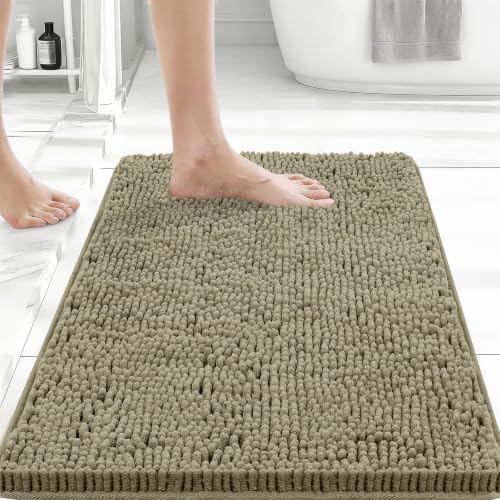
Bath mats, towels, dispensers, and storage baskets can change the balance without wall damage. A neutral bath mat should relate to the floor rather than disappear into it, and absorbent textiles should be allowed to dry fully between uses.
For a small room, a guide to bath mat shapes that suit compact bathrooms can help with proportion before you commit to a color. Keep the textile pattern restrained if the floor already has terrazzo movement or stone veining.
Soap dispensers are another small but visible detail. A simple form in a finish that echoes the tap can make the basin zone feel deliberate; removable adhesive or freestanding storage keeps the change reversible.
Partial updates can still look cohesive
A full renovation is not required for a calm neutral scheme. Clean the existing grout with a compatible method, replace tired textiles, adjust the mirror if the fixing allows it, and introduce one material that connects the fixed finishes to the new accessories.
Do not paint over tile, sealant, or wet-area surfaces without checking the rental agreement and the product’s intended use. A removable mirror or carefully selected textile usually carries less repair risk than an improvised coating.
For towel planning in a compact room, quick-drying towel options for small bathrooms can be considered as part of the room’s moisture routine, not merely as a color choice.
Cost is more than the first installation
Simple-looking materials can carry different future costs through cleaning, sealing, replacement, and repair. A natural stone surface may require more careful products and periodic sealing, while a complicated tile layout can make future patching more difficult if matching stock is unavailable.
Maintenance cost in a neutral bathroom is shaped by material care and replacement difficulty, not by color alone. Before approving a finish, ask how it will be cleaned, what can damage it, whether spare material can be stored, and whether a renter can restore the original condition.
Frequently Asked Questions
How can neutral bathroom inspo feel warm instead of bland?
Build warmth through undertone and texture rather than adding many decorations. Pair a compatible warm white or greige with white oak, honed stone, brushed nickel, woven textiles, or a softly contrasting grout. Keep one surface quieter so the room can breathe. Check the whole group in daylight and with the bathroom lighting on, because a warm neutral can become yellow or pink beside the wrong white.
Should the floor, shower walls, vanity, and countertop match?
No. Matching everything can flatten the room, especially if each material has the same sheen and scale. Choose a related family, then vary one or two qualities: a quiet porcelain floor, a lightly textured wall, a plain vanity, and a subtly veined counter can work together. The fixed surfaces should be sampled as a group before any final tile or stone decision.
Is porcelain tile easier to maintain than marble or limestone?
Porcelain tile is often the simpler route for a low-maintenance neutral scheme, while marble and limestone can etch, stain, or require sealing. The comparison still depends on the specific tile, grout, installation, and cleaning products. Natural stone should not be exposed to acidic or incompatible cleaners. Ask for care instructions before installation, and include grout in the maintenance plan.
Why do neutral bathrooms show grout discoloration and water spots so clearly?
Pale grout and glossy surfaces create visible contrast with deposits, streaks, and changes in color. Moisture, soap residue, poor ventilation, and incompatible cleaning products can all make the problem more noticeable. Ventilation and regular compatible cleaning matter more than choosing a darker palette as camouflage. Persistent discoloration should be reported in a rental because it may indicate a moisture issue rather than ordinary styling wear.
How do I choose hardware for a neutral bathroom without creating clutter?
Start with the fixed tap and shower finish, then select removable accessories that relate to it. Brushed nickel can bridge warm and cool neutrals, chrome supports a brighter crisp scheme, brass adds warmth, and matte black provides strong contrast. Use one dominant metal language and let any second finish appear sparingly. For a basin area, a compact soap dispenser that coordinates with existing hardware is a reversible detail rather than a permanent commitment.