The paint color you choose changes how a bedroom looks, feels, and even reads in size — more than almost any other single decision in a redesign. Before you commit to a color, it helps to think through two practical variables most paint-color lists skip: room orientation and finish.
North-facing bedrooms get cooler, bluer daylight, so warm colors (beige, terracotta, warm gray) tend to balance that out, while south-facing rooms already run warm, so cooler colors read closer to true. Sheen matters too: darker, more saturated colors in a matte or eggshell finish absorb more light, which can make a small room feel smaller — but also noticeably cozier at night, a trade-off worth choosing on purpose rather than by accident.
A standard gallon of paint covers roughly 350 to 400 square feet with one coat, so a typical bedroom usually needs one to two gallons for a full two-coat job — worth knowing before falling for a color that needs extra trips to the paint counter. The 15 colors below range from quiet neutrals to colors that ask a room to make a statement.
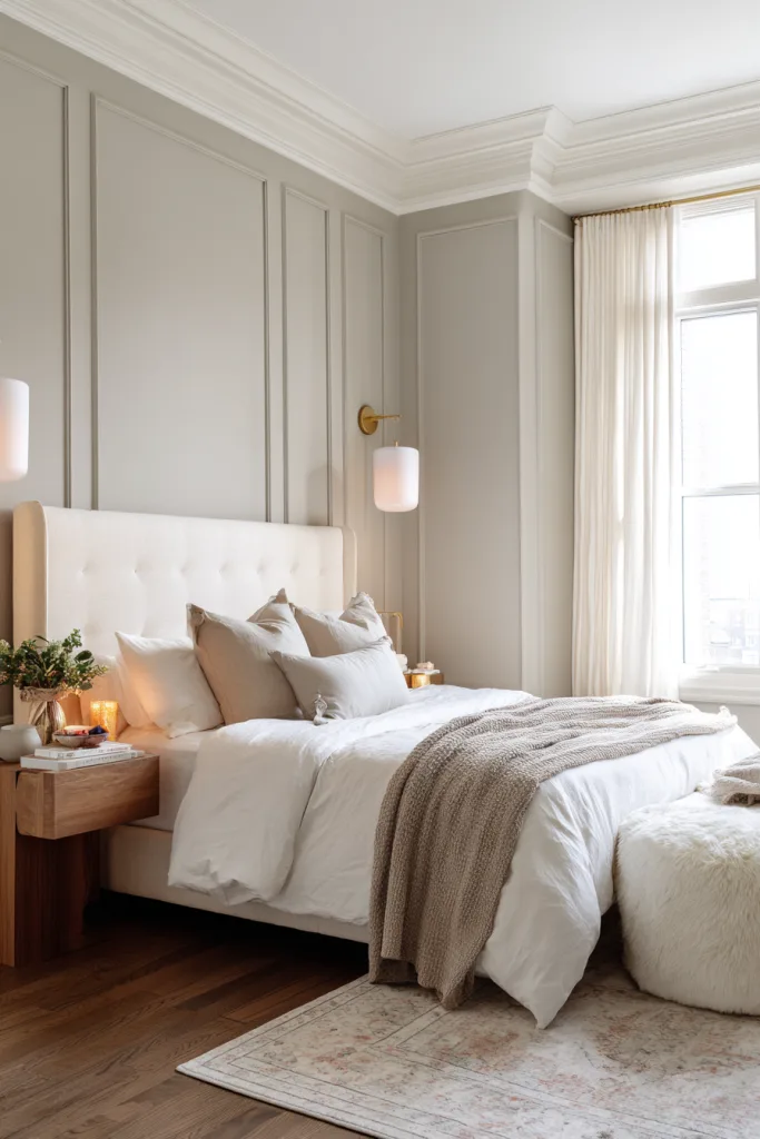
1. Whisper Soft Gray
Soft gray remains one of the most reliable bedroom neutrals because it works as a backdrop rather than a statement — it lets furniture, bedding, and art do more of the visual work. Choose a gray with a warm undertone (a hint of beige or taupe rather than blue) if the room doesn’t get much direct sun, since a cool-toned gray in flat north light can read closer to cold than calm.
Pair it with warm wood tones — oak, walnut, or mid-tone maple — and crisp white trim so the room doesn’t feel flat. In an eggshell or satin finish it reflects enough light to keep a smaller bedroom feeling open while still reading soft rather than stark. Test a sample on the wall you see first from the doorway, since gray shifts more than most colors between morning and evening light.
2. Calming Sage Green
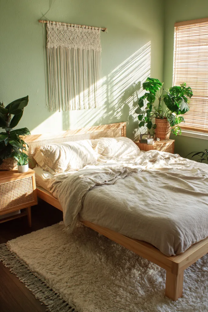
Sage green sits between a true green and a neutral, which is why it works in bedrooms that want a hint of color without committing to a full accent wall. Cooler, muted greens are commonly described as calming in design writing — worth trying if you want a quieter mood, though that’s a design convention rather than a proven effect.
It works especially well with natural materials — rattan headboards, jute rugs, lightly stained wood — since the muted tone doesn’t compete with texture the way a brighter color would. A common mistake is pairing sage with cool grays, which can make both colors look washed out; warm accents (cream, terracotta, brass) generally read better against it. Use a matte or eggshell finish for a soft, non-reflective look.
3. Serene Powder Blue
Powder blue is a light, low-saturation blue that reads as airy rather than cold, which is why it’s a common choice for smaller bedrooms — pale colors reflect more of the available daylight, so the room can feel more open than its actual square footage. Cooler blues are commonly associated with a calmer mood in design writing, though that’s a stylistic convention, not a clinical claim.
Orientation matters more with blue than almost any other color here: in a north-facing room with cooler light, powder blue can start to look gray or flat, while in a south-facing room it stays true to the swatch. If your bedroom faces north, look for a powder blue with a slightly warmer, grayer base, and balance it with warm metals (brass or gold) and natural wood so the room doesn’t feel chilly.
4. Rich Warm Beige
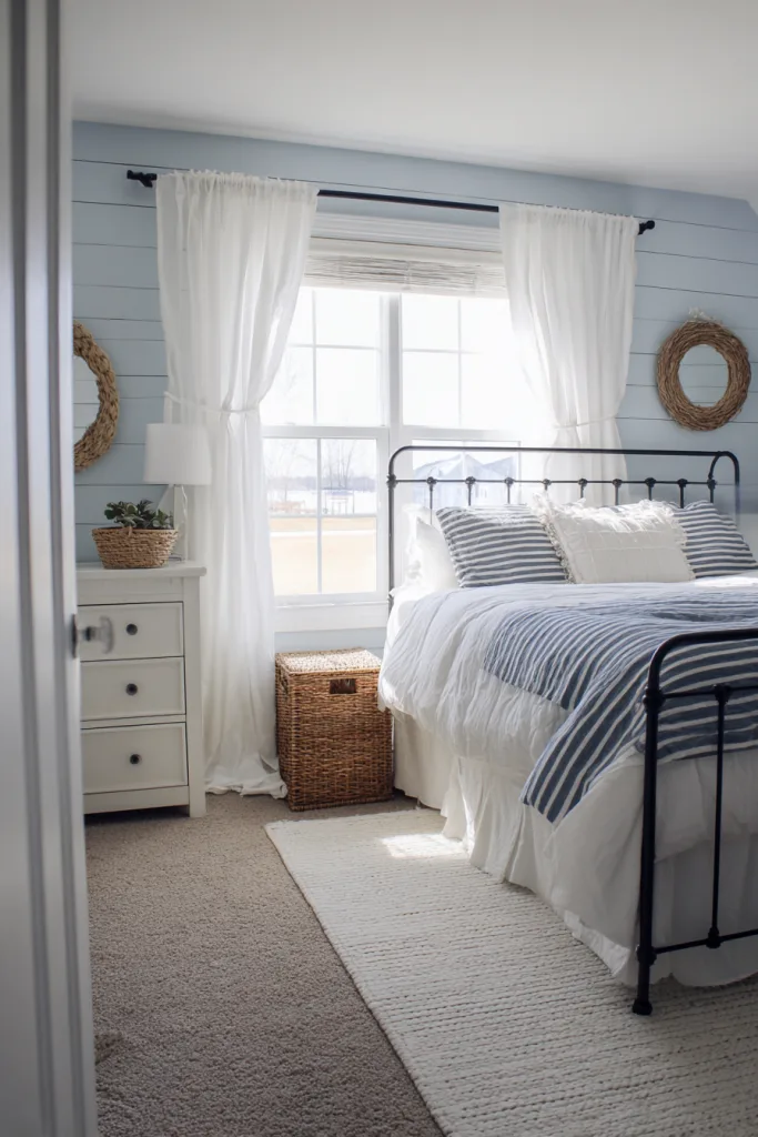
Warm beige works with nearly any furniture style and doesn’t date quickly, which is why it remains one of the most commonly repainted bedroom colors. The detail that makes or breaks beige is undertone: golden or peachy undertones read warm and inviting, while gray or pink undertones can look murky depending on the light.
Bring a sample home and check it in your own room at different times of day before buying a full gallon — beige is notoriously undertone-sensitive and can shift more than expected between store lighting and home lighting. Layer several shades of beige, cream, and tan through bedding and rugs, then add contrast with chocolate brown or charcoal accents so the room doesn’t read as one flat block of color.
5. Romantic Dusty Rose
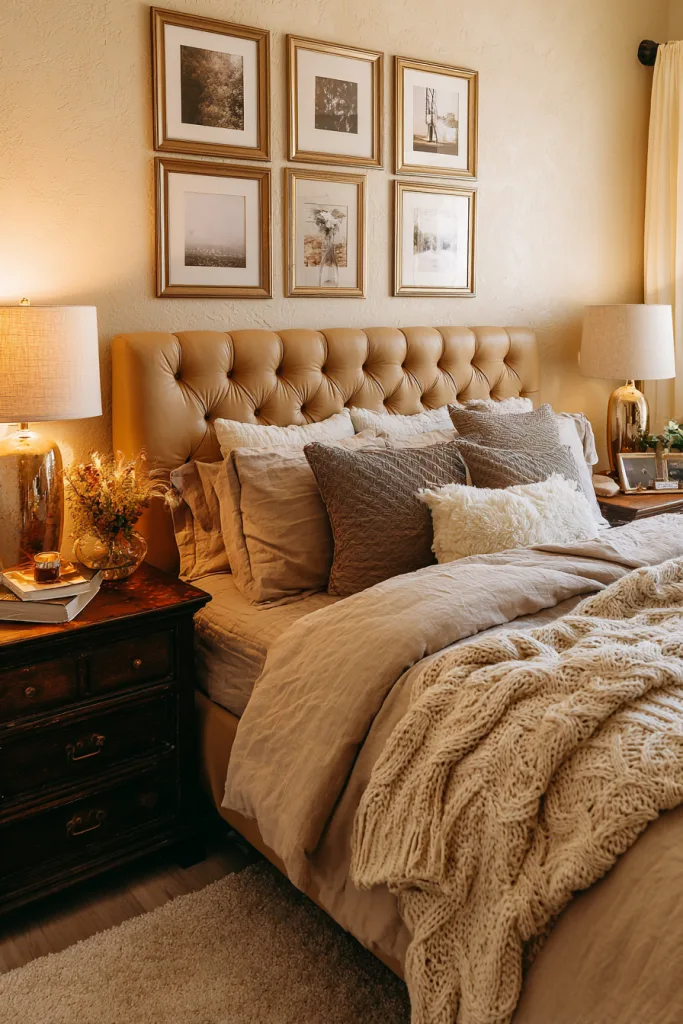
Dusty rose is a muted, grayed-down pink, which is what keeps it from reading as overly sweet the way a brighter pink can. Because the gray content mutes the color, it functions almost like a neutral — it pairs with both warm and cool accents, which makes it a fairly low-risk way to bring in a hint of color.
The main styling risk is going too soft across the whole room; balance it with at least one harder-edged, darker material — black metal light fixtures, a dark wood frame, or charcoal bedding — so the palette doesn’t collapse into mush. In eggshell or satin finish it has enough sheen to look intentional rather than washed out. Cream, soft gold, and warm gray all work as supporting neutrals.
6. Bold Navy Blue
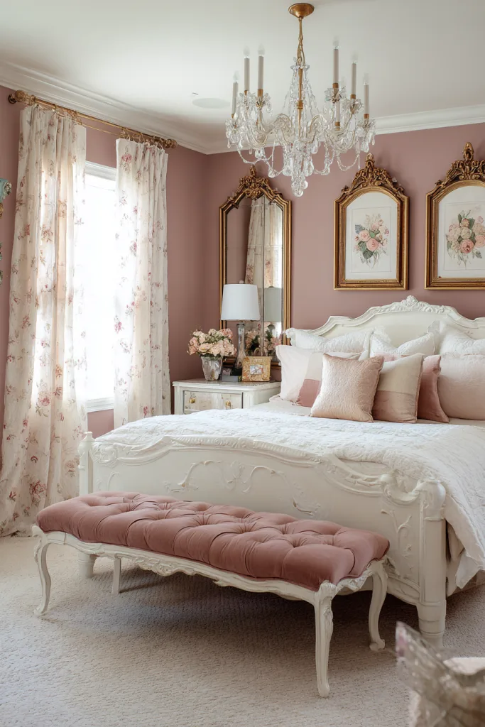
Navy is a genuinely good bedroom option despite the instinct that dark colors shrink a small space — the trade-off runs both ways. A darker, saturated color in a matte or eggshell finish absorbs more light, which can make a small room feel smaller, but it also makes the room feel more enclosed and cocoon-like at night, which is often exactly the effect people want in a bedroom.
Navy tends to work best in a room with at least one larger window or good artificial lighting, so the darkness reads as intentional rather than dim. It provides strong contrast for brass, copper, or gold hardware and light fixtures. If you’re not ready to commit all four walls, a single navy wall behind the headboard gives you the effect with an easier repaint later if you change your mind.
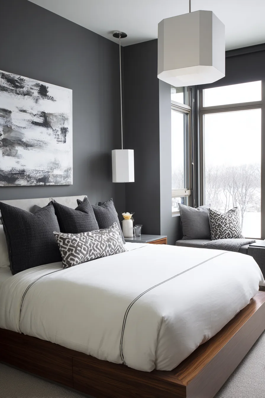
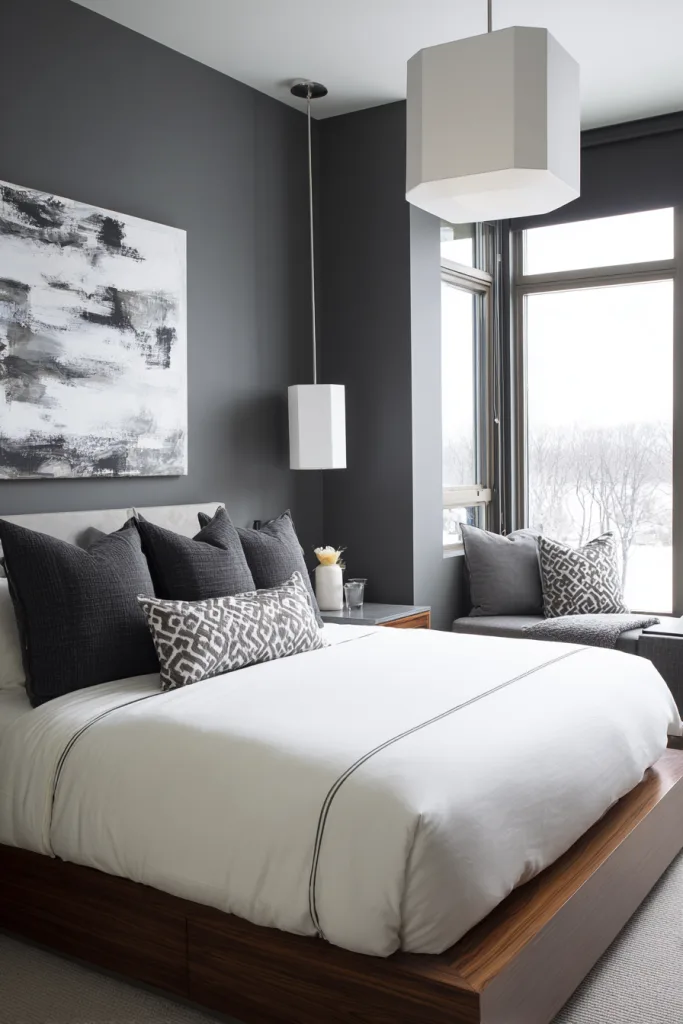
7. Sophisticated Charcoal
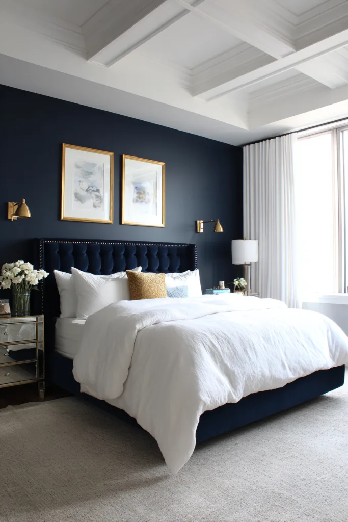
Charcoal is a near-black gray that reads as more versatile than true black — dark enough to feel grounding and modern without the same commitment. Like navy, it’s a saturated dark color, so expect it to absorb more light than a pale neutral; plan for stronger lamp and overhead lighting than you’d use with a lighter wall.
It creates real contrast against crisp white trim and bedding for a graphic look, or against warm wood and leather for something softer. A common mistake is using charcoal in a room with only one small window and no supplemental lighting plan, since the room can end up reading dim rather than intentional. Test a large swatch — at least 2 feet by 2 feet — and view it after dark with your actual lamps before deciding.
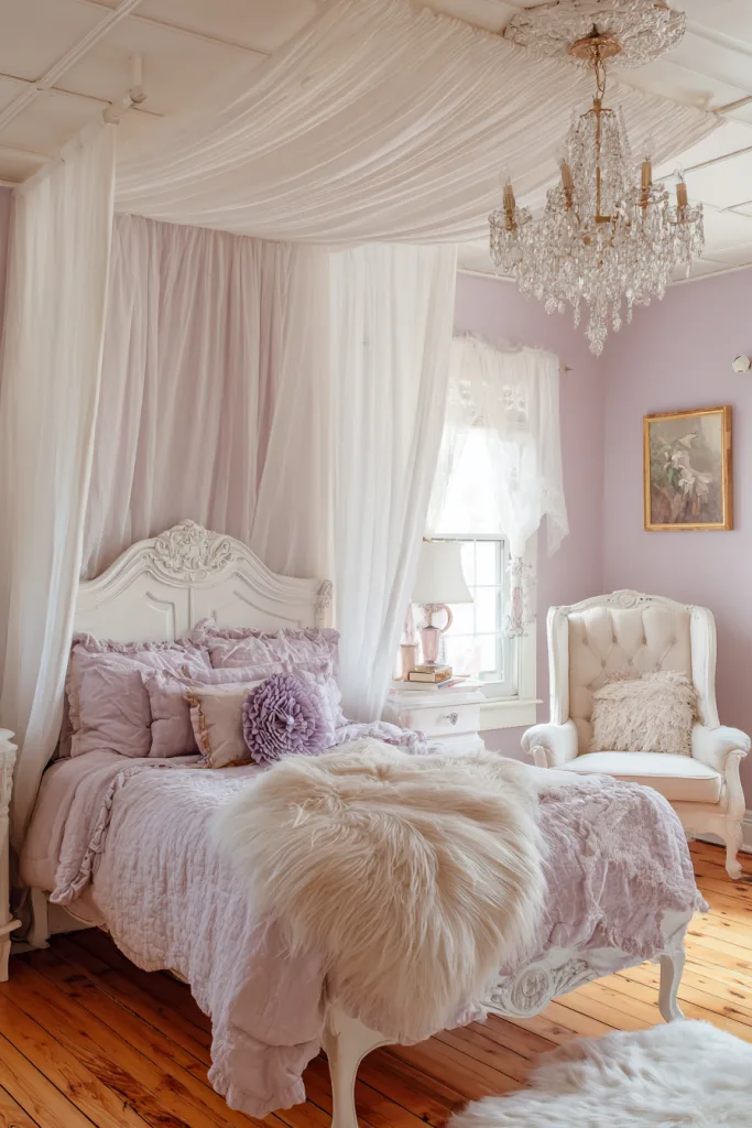
8. Dreamy Pale Lavender
Pale lavender is a low-saturation purple with enough gray mixed in to keep it from reading as childish. Purple and lavender are sometimes described as calming in design and color-theory writing, similar to blue and green, though — as with any color-mood claim — that’s a design convention rather than a settled fact.
Keep the rest of the room light and uncomplicated so the lavender doesn’t compete with too many other colors — white or cream furniture, natural linen textiles, and one or two metallic accents tend to work best. Lavender is also undertone-sensitive: a swatch with too much blue can drift toward gray in low light, so check it against your actual window light before painting the full room.
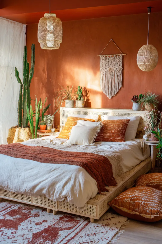
9. Warm Terracotta
Terracotta is a warm, earthy orange-red that brings real color into a bedroom without the intensity of a true red — it reads as grounded rather than stimulating. It tends to look best in rooms with a reasonable amount of natural light, since the warmth of the color pairs naturally with daylight; in a consistently dim, north-facing room it can start to feel heavy rather than cozy.
It works well with natural materials — woven baskets, leather, carved or reclaimed wood — for a lived-in, textural look. Because it’s a strong color, consider it as a single accent wall first if you’re unsure, since a full-room terracotta bedroom is a bigger visual commitment than most colors on this list. Balance it with plenty of cream, ivory, or natural linen so the room has room to breathe.
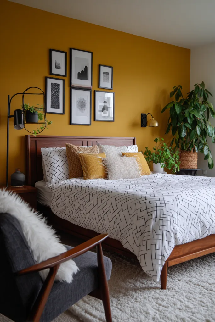
10. Energizing Mustard Yellow
Mustard is a muted, golden yellow rather than a bright primary yellow, which is what keeps it from feeling overstimulating in a room meant for rest. Warmer colors like yellow and orange are commonly described in design writing as energizing rather than calming, so mustard tends to work better as an accent than as the color you fall asleep looking at — many people use it on a single wall or in furniture and textiles rather than across an entire bedroom.
It’s a genuinely useful color for a bedroom that gets little natural light, since warm tones can make a dim room feel brighter without adding more actual light. Pair it with charcoal or navy for real contrast, or keep it softer with white and natural wood. Keep bedding neutral so the color doesn’t compete with itself.
11. Timeless Creamy Ivory
Ivory is essentially white with a warm undertone added, which solves the main complaint people have about pure white walls — that they can look sterile under artificial light. It reflects light nearly as well as true white, so it’s a solid choice for a bedroom that needs to feel brighter or larger, while still reading soft rather than clinical.
Because it’s so close to neutral, ivory is one of the lowest-risk colors on this list — it works with almost any furniture style or accent color added later. The trade-off is that it shows minimal personality on its own, so plan on layering texture (velvet, linen, wool) and a few stronger accent colors through bedding, art, or a rug to keep the room from feeling flat.
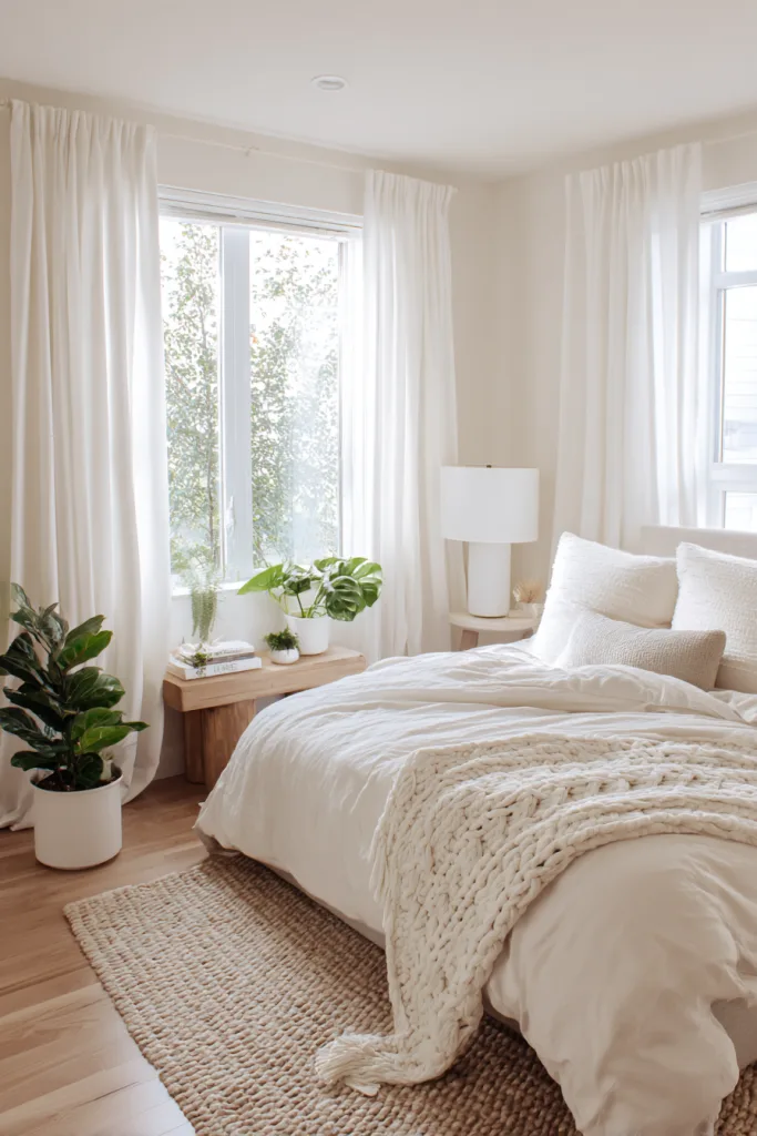
12. Luxurious Deep Burgundy
Burgundy is a dark, wine-toned red that behaves like navy or charcoal in terms of light absorption — expect a matte or eggshell burgundy wall to make a small room feel more enclosed, which reads as intimate in a bedroom rather than a drawback. It’s one of the more committed colors on this list, so it tends to work best either on all four walls for a fully wrapped effect, or on a single wall behind the bed if you want the option to change course later.
It pairs well with brass or gold fixtures, which pick up warmth from the red undertone, and with cream or ivory textiles so the room doesn’t feel too heavy. Velvet and silk finishes on bedding read especially well against a burgundy wall.
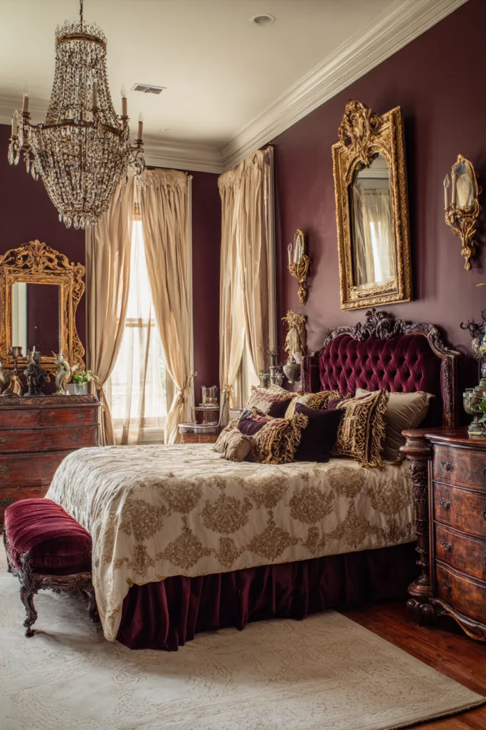
13. Modern Pale Gray
Pale gray is lighter and cooler than the warm-undertone gray earlier in this list, and it behaves differently depending on the room’s orientation — in a north-facing room it can read distinctly cool or slightly blue, while in a sunnier, south-facing room it warms up and softens. Worth testing a swatch in your actual room, since this is one of the more light-dependent colors here.
It’s a natural fit for a Scandinavian-style bedroom: pair it with light wood furniture, white bedding, and minimal black accents for a clean look, or add wool, linen, and sheepskin textures so it doesn’t feel cold. In eggshell finish it reflects enough light to keep a small bedroom feeling open.
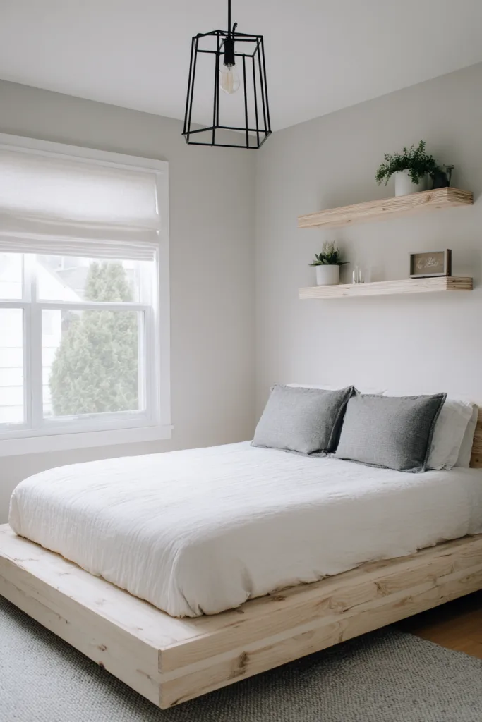
14. Grounding Olive Green
Olive sits between sage and a true forest green — deeper and more muted than sage, but not as saturated as emerald or hunter green. That middle position is what makes it work in a bedroom: it reads as grounded and a little moody without tipping into a color that’s hard to live with day to day.
It pairs naturally with warm wood tones, leather, and brass hardware, and holds up well against black accents for contrast. Because it’s a deeper, more saturated color, treat it the same way as navy or charcoal — plan for slightly stronger lighting than a pale neutral needs, and test a large sample swatch before committing to all four walls.
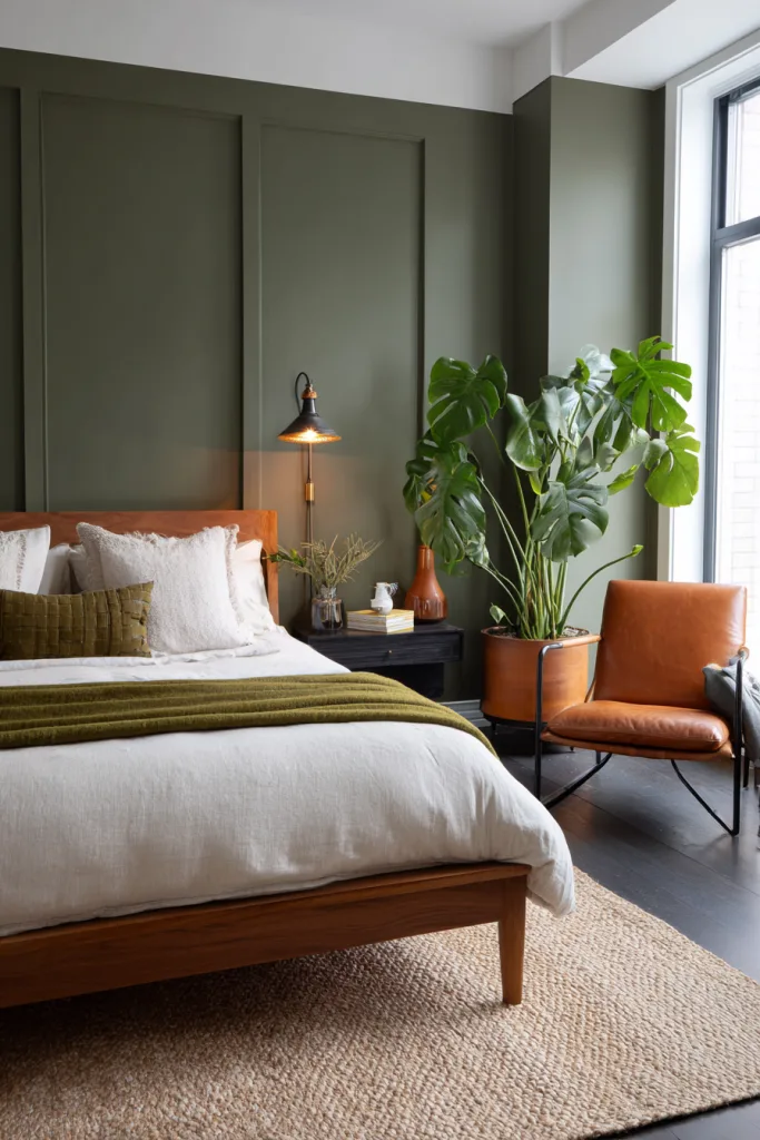
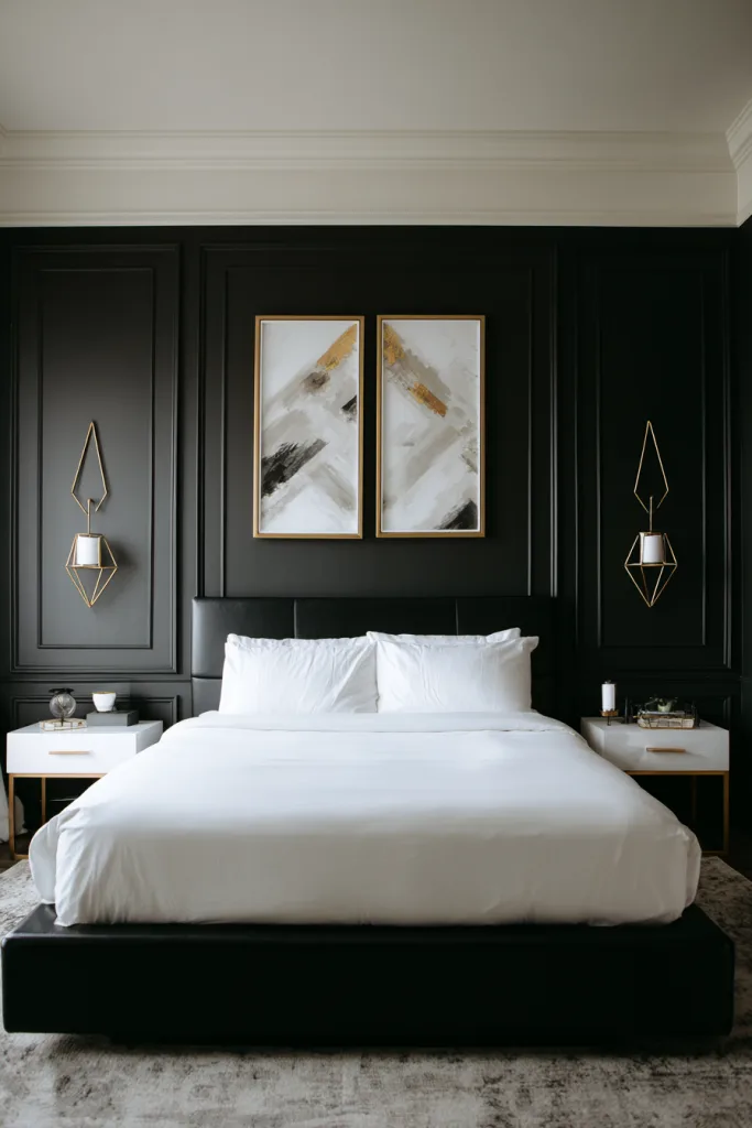
15. Dramatic Black Accent Wall
A full black bedroom is a serious commitment, which is why most people who want the look use it as a single accent wall — typically behind the headboard — rather than on all four walls. Black absorbs more light than any other color on this list, so it works better as a backdrop for white bedding and brighter accents than as the room’s main light source.
Keep the remaining three walls light (white, cream, or pale gray) to balance the room and prevent it from feeling boxed in. Layer in multiple light sources — a table lamp, a wall sconce, overhead lighting — since a black wall combined with only one ceiling fixture can make the corner feel flat rather than dramatic. Brass or copper hardware adds warmth against the black.
Choosing Your Color
There’s no universally “right” bedroom color — only the right color for your room’s light, size, and the mood you’re after. Before committing to a full gallon, paint a sample swatch at least 2 feet square directly on your wall and look at it in the morning, at midday, and again after dark with your actual lamps — paint color shifts more across a day than most people expect, and store lighting rarely matches home lighting.
If you’re estimating cost or time, remember that one gallon covers roughly 350 to 400 square feet per coat, and most colors need two coats for even coverage, so budget accordingly before falling for a shade that turns out to need extra trips to the store.
Frequently Asked Questions
What’s the best paint finish for bedroom walls?
Eggshell or satin finish is the standard recommendation for bedroom walls — both have enough sheen to wipe clean without being reflective, and they hide minor wall imperfections better than a flatter finish. A true matte finish gives a slightly more elevated, non-reflective look but shows scuffs more easily over time. High-gloss finishes are best avoided on large bedroom walls since they read as more reflective and less restful.
How do I choose between warm and cool paint colors?
Start with your room’s natural light. North-facing rooms get cooler, bluer daylight, so a warm color (beige, cream, warm gray, terracotta) tends to balance that out and keep the room from feeling flat. South-facing rooms already run warm, so cooler colors (blues, greens, cooler grays) read closer to true. Beyond orientation, it’s also a matter of preference — warm colors tend to feel cozier and more enclosed, cool colors tend to feel more spacious and calm.
Should I paint all walls the same color or create an accent wall?
Painting all four walls the same color creates a cohesive, wrapped feeling and tends to make a room look larger, since there’s no visual break where one wall stops and another starts. An accent wall is the lower-risk option for bolder or darker colors — navy, black, burgundy — since it lets you try the effect without repainting the whole room, and it’s a smaller job to redo if you change your mind.
How many paint samples should I test before deciding?
Three to five is a reasonable range. Paint swatches at least 2 feet by 2 feet directly on the wall rather than relying on a small paper chip, since color reads differently at that scale. Live with the samples for at least 48 hours and check them in morning light, afternoon light, and evening artificial light, since most paint colors shift noticeably across those three conditions.